What Hi-Fi? Verdict
Improved rivals see the Sharp go down to three stars – but it’s still a fine 3D TV
Pros
- +
Vibrant but natural colours
- +
decent detail and contrast
- +
good scaler
- +
reasonable sound
Cons
- -
Reflective panel
- -
no Freeview HD
- -
backlight isn’t even
- -
iffy EPG
- -
imperfect motion
Why you can trust What Hi-Fi?
Sharp’s last big win in these pages was some time ago, there have recently been a couple of models that have impressed us – including this one.
The thing is, while back in January this looked like a rather affordable big-screen 3D display, the appearances of similarly sized and supremely comptent rivals have altered the playing field, and the Sharp doesn’t look like quite as good a deal.
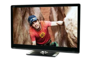
It does look rather fine in its own right, though. It’s nice that Sharp hasn’t tried to copy Samsung or Sony styling, instead going for a unique, round-edged design that looks smart and stylish without looking hard and aggressive.
The decision to go with a heavily mirrored panel is slightly less successful: reflections help make your room look bigger (so certain floppy-haired TV interior-design pundits tell us, anyway), but the last thing you want to see during the dark scenes of The Town is your own mug gurning back at you.
Keep the lights down low, though, and the Sharp does have a good go with Blu-rays.
It sharply defines the interiors of houses, exhibits vibrancy and control in its representation of all the colours on display, and digs up plenty of detail in dark corners.
The worn, lined face of the late, great Pete Postlethwaite, meanwhile, looks almost 3D – without even needing the special specs.
Strong with panning
The Sharp’s motion processing has much in common with its rivals, in that it’s strong with slow panning shots, but a little weaker with the kind of fast, unpredictable motion that you find in The Town’s opening heist.
While its backlight is capable of producing very decent contrast levels, it suffers from just a touch of unevenness that, while only visible in extremely dark pictures, is still a shame nonetheless.
When you do switch to 3D there’s a bit of smear to motion and some irritating crosstalk, but generally it’s a punchy, colourful and well-defined image with decent overall picture depth.
Blacks are deep, too, though we wouldn’t mind a little more insight into them.
The lack of a Freeview HD tuner is, of course disappointing, but the Sharp does a respectable job of upscaling standard-definition content.
It is a shame too that the programme guide and menus are cluttered and slow to respond.
We can see what the company was going for – an icon system with drop-down options, à la Sony’s XrossMediaBar – but it misses the mark trying to cram too much in.
There’s still a lot to like
You’ll get used to it, we’re sure, but there’s no denying that the menu system should be a little prettier and more intuitive.
Still, at least you can keep watching a program in the mini window – which on this telly is still 45in!
The Sharp is, obviously, just as good now as it was before – it’s just that those pesky rivals have forced us to re-evaluate its star rating.
Don’t discount it, though, especially if you find it with a nice discount.
What Hi-Fi?, founded in 1976, is the world's leading independent guide to buying and owning hi-fi and home entertainment products. Our comprehensive tests help you buy the very best for your money, with our advice sections giving you step-by-step information on how to get even more from your music and movies. Everything is tested by our dedicated team of in-house reviewers in our custom-built test rooms in London, Reading and Bath. Our coveted five-star rating and Awards are recognised all over the world as the ultimate seal of approval, so you can buy with absolute confidence.


