What Hi-Fi? Verdict
It’s great for for calls and browsing, but rivals pip it for audio and video quality
Pros
- +
Nicely built
- +
big screen
- +
fast interface and internet browsing
- +
smooth motion to video
Cons
- -
Audio lacks a little excitement
- -
colours are slightly dull
Why you can trust What Hi-Fi?
You’d be forgiven for having let the Samsung Galaxy Nexus slip your mind in recent months.
You’d be forgiven for having let the Samsung Galaxy Nexus slip your mind
in recent months. With all the fanfare surrounding the HTC One smartphones and latterly Samsung’s own S3, the Nexus might have dropped off your radar. But as the first collaboration between Google’s Nexus range and Samsung’s Galaxy family, it’s no
surprise that it’s well worth taking note.
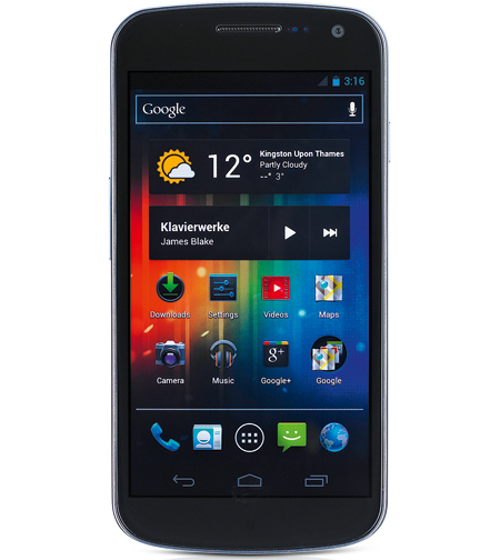
Announced at the launch of Android 4.0 (Ice Cream Sandwich), this was the first phone to sport the new operating system. With a 4.65in screen, it was ahead of the curve when it came to big-screens, and the 1280 x 720 display is still more than fine. There’s a 1.2GHz dual-core chip on board, as well as a 16GB memory, though no SD-card slot.
Svelte but solid, the tapered design gives your hand something to grip – helped by the ribbed rear casing – and together with the black and grey styling it has a real business casual feel to it.
The Galaxy Nexus does away with physical buttons, instead providing three touch icons at the bottom of
the display, beneath five customisable home screens.
Smooth and fast, but not the best
Moving around the interface remains slick and speedy. Some neat touches – the way each page of apps rolls over the next and the fact that the key icons rotate when the screen’s in landscape mode, for example – really make sure you feel like you’re getting a premium, cutting-edge smartphone experience.
On the front page, you’ll find a
Google folder that comes pre-loaded with Maps, Navigation, Google+ and
more; otherwise the Galaxy Nexus unsurpisingly relies on the Google Play store for apps, books, games and movies.
Browsing the net is smooth and
fast, with text reformatting quickly as you pinch in and out, and web pages loading quickly. It’s Flash enabled, too.
The screen isn’t quite as dynamic
or as bright as the newest models, no matter how much you crank up the brightness, with whites appearing a little duller and text seeming a little subdued and not displaying quite as clearly.
This marginal dullness extends to media playback, too. While motion
is handled smoothly and skin-tones
are realistic, the class-leading blowers now deliver a punchier, more dynamic presentation. What’s more, they
display edges a smidgeon more
sharply, and their overall images
are a touch cleaner, too.
Don’t get us wrong – the Nexus
still looks great at times, but there’s
no denying that the best have raised
the bar for video performance.
Similarly, it now lacks a little excitement in the audio department. Lone’s New Colour sounds a little restrained and rounded-off around
the egdes, while even a blast of the Philarmonia Orchestra sounds accurate and detailed but a little uneventful.
Despite the lower-resolution 5MP camera, pictures prove pretty good (albeit a little over-saturated), and the digital zoom is better than many here – though still not up to optical standards.
We’ve no problem with the call quality either, and while the battery isn’t great
it should last a day or so with medium use – about par for the course.
It’s in audio and video performance where the (slightly) older Galaxy Nexus feels the heat, but for design and basic functionality it’s still very impressive
With all the fanfare surrounding the HTC One X smartphones and latterly Samsung’s own Galaxy S III, the Nexus might have dropped off your radar.
But as the first collaboration between Google’s Nexus range and Samsung’s Galaxy family, it’s no surprise that it’s well worth taking note.
Announced at the launch of Android 4.0 (Ice Cream Sandwich), this was the first phone to sport the new operating system. With a 4.65in screen, it was ahead of the curve when it came to big-screens, and the 1280 x 720 display is still more than fine.
There’s a 1.2GHz dual-core chip on board, as well as a 16GB memory, though no SD-card slot.
Samsung Galaxy Nexus: Design
Svelte but solid, the tapered design gives your hand something to grip – helped by the ribbed rear casing – and together with the black and grey styling it has a real business casual feel to it.
The Galaxy Nexus does away with physical buttons, instead providing three touch icons at the bottom of the display, beneath five customisable home screens.
Moving around the interface remains slick and speedy. Some neat touches – the way each page of apps rolls over the next and the fact that the key icons rotate when the screen’s in landscape mode, for example – really make sure you feel like you’re getting a premium, cutting-edge smartphone experience.
On the front page, you’ll find a Google folder that comes pre-loaded with Maps, Navigation, Google+ and more; otherwise the Galaxy Nexus unsurpisingly relies on the Google Play store for apps, books, games and movies.
Samsung Galaxy Nexus: Performance
Browsing the net is smooth and fast, with text reformatting quickly as you pinch in and out, and web pages loading quickly.
It’s Flash enabled, too.The screen isn’t quite as dynamic or as bright as the newest models, no matter how much you crank up the brightness, with whites appearing a little duller and text seeming a little subdued and not displaying quite as clearly.
This marginal dullness extends to media playback, too. While motion is handled smoothly and skin-tones are realistic, the class-leading blowers now deliver a punchier, more dynamic presentation.
What’s more, they display edges a smidgeon more sharply, and their overall images are a touch cleaner, too.
Don’t get us wrong – the Nexus still looks great at times, but there’s no denying that the best have raised the bar for video performance.Similarly, it now lacks a little excitement in the audio department.
Lone’s New Colour sounds a little restrained and rounded-off around the egdes, while even a blast of the Philarmonia Orchestra sounds accurate and detailed but a little uneventful.
Samsung Galaxy Nexus: Camera
Despite the lower-resolution 5MP camera, pictures prove pretty good (albeit a little over-saturated), and the digital zoom is better than many here – though still not up to optical standards.
We’ve no problem with the call quality either, and while the battery isn’t great it should last a day or so with medium use – about par for the course.
Verdict
It’s in audio and video performance where the (slightly) older Galaxy Nexus feels the heat, but for design and basic functionality it’s still very impressive.
See all our Android smartphone reviews
What Hi-Fi?, founded in 1976, is the world's leading independent guide to buying and owning hi-fi and home entertainment products. Our comprehensive tests help you buy the very best for your money, with our advice sections giving you step-by-step information on how to get even more from your music and movies. Everything is tested by our dedicated team of in-house reviewers in our custom-built test rooms in London, Reading and Bath. Our coveted five-star rating and Awards are recognised all over the world as the ultimate seal of approval, so you can buy with absolute confidence.


