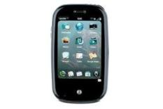
The Palm Pre is the most eagerly awaited phone of the year. Plenty of hype has left multimedia addicts chomping at the bit for this dinky pebble portable. Why? Well its main claim to fame is the multi-tasking,
multi-touch WebOS interface.
What the iPhone can't do, the Palm Pre can, allowing you to have any number of programs up and running in unison. It calls this Card View.
No need to close applications, simply shrink each window, or card, and then browse from one to another with a sweeping motion across the screen.
Finished what you're doing? Swipe the card off the top of the screen and the app closes. It all works brilliantly, making the delay when opening apps for the first time a real shame.
The multi-touch screen works in tandem with a click button at the bottom of the unit, volume controls on the top-left and a power/lock button on the top-right edge.
We're not convinced by the position of the top controls, and the added touch controls on either side of the click button are unnecessary and confusing.
The more we use the Palm Pre, the less keen we are on the exterior design. Sliding it open to reveal the full Qwerty keyboard means a grubby thumb on the small 3.1in, 480 x 320 screen – and you might open an application in the process, making the unit quite fiddly to use.
Hit and miss performance
Drag and drop some music and video to the '8GB' internal memory (there's around 7GB available to use) and while the interface for content is clean, it's a touch sluggish.
Still, audio playback (MP3, AAC and WAV, not Lossless or WMA) is good, only lacking subtlety compared to the you-know-what.
MPEG-4 video is more obviously a step down – rivals deliver noticeably better contrast levels and sharpness. Switch to the browser and although it's simple to use, rendering of web pages could be snappier.
Elsewhere, Palm Synergy is a nice tool that brings your various calendars together. There's also a 3MP camera with flash as well as access to applications from Palm.
It works in a similar vein to Apple's App Store, but it's just not quite there as a product.
The Palm Pre's clever interface is tempered by slow loading, the initially impressive exterior design has weaknesses, and AV performance is good, but not great. It's a near miss.
Follow whathifi.com on Twitter

