What Hi-Fi? Verdict
Premium build, a lovely camera and increasingly strong app content: this is the best Windows Phone yet
Pros
- +
Lovely, premium build
- +
Excellent camera
- +
Growing number of apps
- +
Vibrant screen with deep blacks
Cons
- -
Needs a case to use wireless charging tech
- -
Video and audio performance not as strong as best
- -
Needs more apps
Why you can trust What Hi-Fi?
A lot is riding on the Nokia Lumia 925. Nokia is trying desperately to become more relevant and is leading the charge for Windows Phone – which is why, only six months since it unveiled the Lumia 920, we’ve got another flagship Nokia Lumia handset in our hands.
It’s a good job, too: the Android army is stronger than ever, with Samsung and HTC grappling for the best smartphone title, and Apple gearing up for its next big move, having just unveiled iOS 7.
VIDEO: Nokia Lumia 925 vs Lumia 920 vs HTC One
Armed with a 1280 x 768 resolution screen – the maximum currently supported by Windows Phone 8 – and a 1.5GHz dual-core Snapdragon processor, the Lumia 925 seems underpowered by the latest standards.
But Nokia doesn’t believe quad-core processors are needed just yet. A good camera seems to be its main focus (sorry), with an extra lens added to its Carl Zeiss optics and respected PureView technology.
Nokia has also introduced metal to the design (for the first time since its Symbian days) and replaced the highlighter-bright colours with black, white and grey. It’s less fun, but more mature – and certainly a different direction for the Finnish firm.
Nokia Lumia 925: design
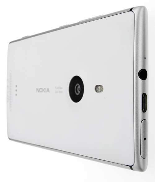
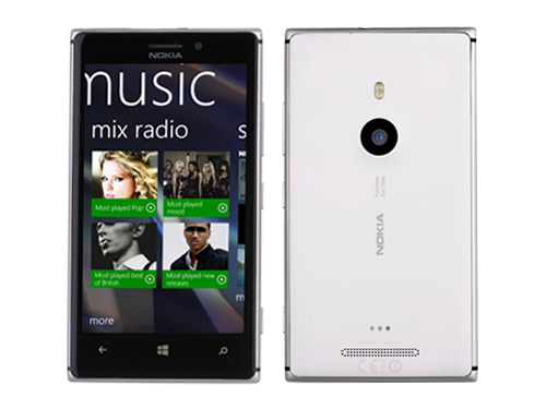
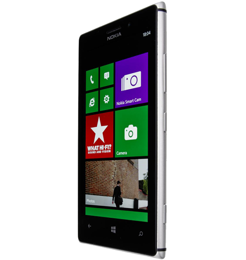
The Nokia Lumia 925 is lovely to hold. Its aluminium frame brings back our first memories of the iPhone 4, while the polycarbonate back feels much like ceramic. The casework is solid, refusing to budge despite our attempts to make it flex. At 139g and 8.5mm, this handset is also noticeably lighter and slimmer than the Nokia 920. The 925 is a nicer design, too, looking and feeling every bit a flagship product.
The front of the phone hasn’t changed much: it’s an expanse of black, with a 4.5in screen. A 1.2 megapixel camera peeks out at the top, while the bottom of the screen has the capacitive buttons for home screen, back and search functions.
On the top edge of the phone you’ll find a micro-SIM tray, a micro-USB charging port, and a headphone socket. On the right edge are keys for volume, power, and camera. These buttons are chunky and easy to press, although things do feel slightly crowded on this side of the phone.
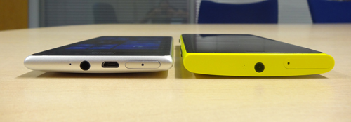
Sadly, there’s no microSD card slot to expand memory. The Lumia 925 comes as standard with 16GB of storage; a 32GB model is also available in the UK, exclusively through Vodafone.
The back of the phone is sealed, with no access to the 2000mAH battery or NFC chip inside. Look to the bottom and you’ll find a small speaker grille and three curious holes. These are connections to a snap-on cover that allows wireless charging. It makes the phone heftier though, and goes against the efforts to streamline the unit.
Considerably more useful is the 8.7MP camera, protruding slightly with a recessed (and table-proof) lens.
Nokia Lumia 925: camera
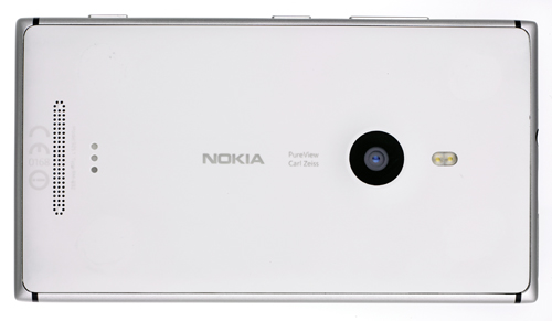
Nokia seems to be the manufacturer putting the most emphasis on smartphone cameras (unless you count the rather niche Samsung Galaxy Zoom). No surprise, then, that it’s this phone’s headline feature.
Its 8.7MP snapper has one more lens than before – bringing the total to six – which is supposed to help with picture sharpness. This works: in comparative tests our 925 pictures were sharper than those taken with the 920. We found the quality of our pictures to be more consistent than on the Lumia 920, too, with an autofocus that’s faster and more accurate.
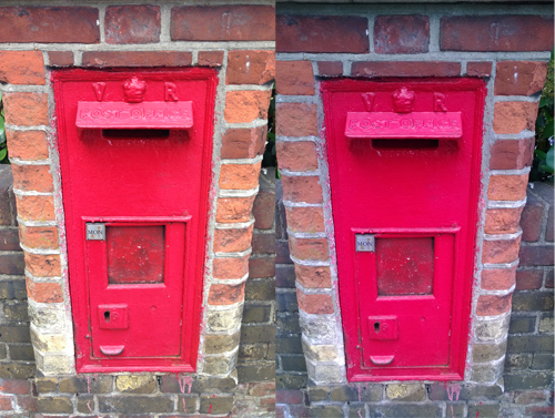
Up against the excellent camera on the iPhone 5, we found the Nokia’s pictures to be slightly more natural and subtle. Our test shots were taken on a typically British day with overcast weather – something that our iPhone doesn’t quite manage to convey, giving the image a false sense of brightness. See below: Apple on the left, Nokia on the right.
Apple iPhone 5 vs Nokia Lumia 925 camera
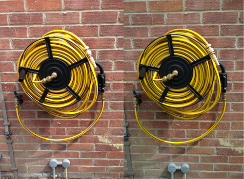
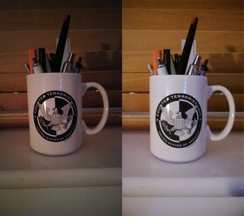
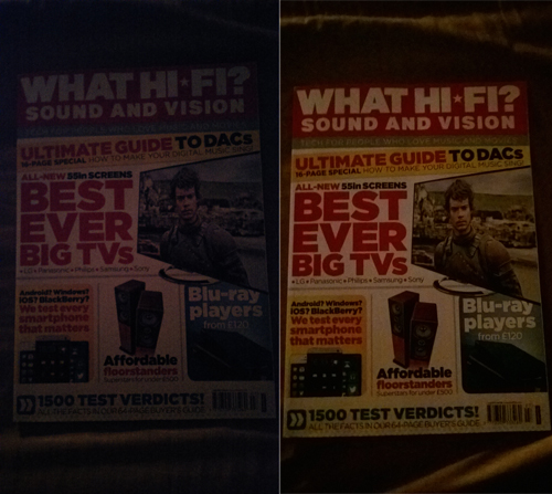
When it comes to low-light photography, the Lumia 925 really shines. We’ve long been fans of the HTC One’s low-light abilities, but the Nokia’s performance is even stronger: its pictures are generally brighter and sharper and have less noise than the HTC’s. Take a look at the snaps below, with HTC on the left and the Nokia Lumia 925 on the right. The one of the magazine cover is particularly telling.
HTC One vs Nokia Lumia 925 camera
A strong camera, then, but Nokia isn’t finished. Take a picture with the new Nokia Smart Cam app and the phone takes 10 shots, then encourages you to edit them.
As with HTC’s Zoe feature, you get to choose the best of the lot – a simple way of dealing with friends who blink a little too much. You can also delete moving objects and unwitting participants.
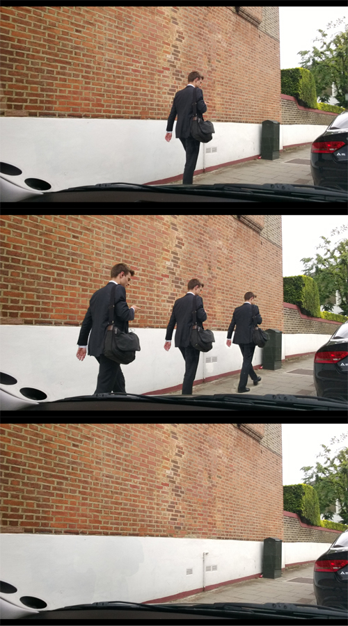
If you want something more exciting, you can combine the photos to create ‘action shots’, which creates a ghost/clone effect behind a moving object. It’s a fun feature, and a bit more creative than just adding a coloured filter.
The camera (with its toys) is one of the Lumia 925’s best features, but don’t let that be the sole deciding factor if you’re trying to choose between the 925 and 920: Nokia has promised to release this software package on all of its Lumia phones.
Nokia Lumia 925: screen
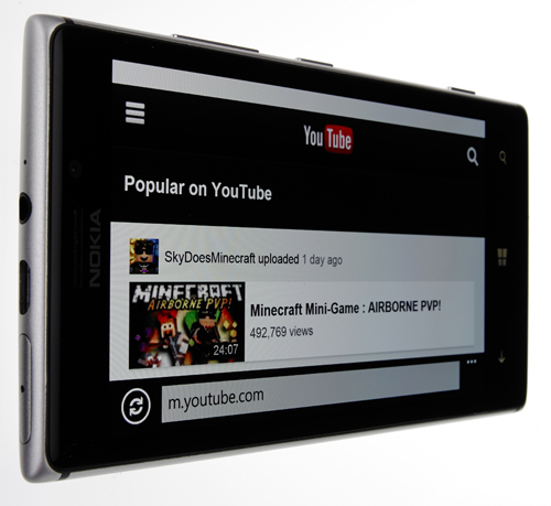
The screen of the Lumia 925 is largely similar to that on its predecessor. It’s a 4.5in display with a resolution of 1280 x 768. The IPS TFT panel, however, has been replaced with AMOLED.
It’s a bold picture with a lot of punch, immediately impressive and looking easily more vibrant than the Lumia 920. Blacks are inkily dark, making the 920 seem slightly washed out. The colour profile is set to ‘enhanced’ by default, which means the punchy colours on the Lumia 925 are a touch exaggerated. Changing this setting to ‘natural’, we were happy with the picture: still vibrant, but more realistic.
HANDS ON: Huawei Ascend P6 review – world's thinnest smartphone
Compared with the 4.7in screen of the HTC One, however, the Lumia 925 struggles. The HTC has the advantage of a Full HD, 1920 x 1080 resolution screen. We watch a scene from Thor and the HTC has a sharper, crisper picture. The shading of colours is more subtle, and there is more texture on capes and beards. The Nokia has deeper blacks, but the HTC has more detail in dark areas.
Elsewhere, Nokia has added the ability to adjust the sensitivity of the screen, which allows you to swipe around with a fingernail or a gloved hand. It’s a sensible addition, and more natural than the ‘hover’ controls offered by the Samsung Galaxy S4.
Nokia Lumia 925: sound
The Lumia 925 is similar to its predecessor when it comes to sound quality: there’s decent punch and dynamics with reasonable detail, though treble notes occasionally veer to brightness. It’s slightly more solid with bass, however. Still, the HTC One is a more engaging listen, with better organisation and greater dynamic reach.
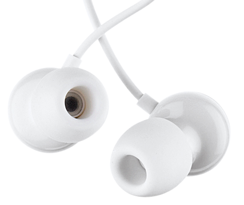
The bundled white earphone buds look quite cool, keeping a low profile with no visible branding. They’re comfortable, but we found the sound needed more substance and detail. If you intend to listen to music seriously on the Lumia 925 then we’d recommend investing in some proper headphones such as the SoundMagic E10s.
Nokia Lumia 925: interface
The Windows Phone 8 operating system is very different from Android or iOS. Anyone already accustomed to either system will need a little time to acclimatise. For those coming fresh to WP8, however, it’s an appealing and intuitive layout.
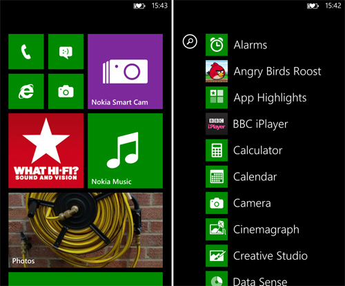
The homepage is where you pin your favourite apps and contacts. One swipe to the right takes you to a simple list, which arranges your apps in alphabetical order. Touch and hold an app for a few seconds and you can add it to your homepage. Items appear on the homepage as ‘live tiles’, which you can resize and reorder to taste. It’s a bit like Tetris.
Under the screen are three capacitive buttons. The ‘Windows’ button takes you back to the home screen from wherever you are in the phone. The ‘Search’ button opens up Bing’s search engine. Tap the ‘Back’ button to return to your previous page, or hold it to move between the apps you have open.
Navigating this ecosystem is lovely. Swiping and scrolling isn’t as lightning-fast as on some Android rivals, but there is a buttery smoothness (aided by simple page animations) that makes using WP8 feel at times like a slicker experience.
This phone may only sport a dual-core processor (most flagship phones are now quad-core), but it never showed any sign of stuttering. During a heavier workout (playing games or using sat-nav for instance), though, the phone did get noticeably warmer.
Nokia Lumia 925: apps
The choice of apps has long been a problem with Windows Phone, and that problem largely persists. There has been progress in the past six months, with the addition of big hitters such as BBC iPlayer, Spotify and, erm, NatWest, but the number and variety of apps is still far behind the offerings from Apple and Android.
Thankfully, some of the built-in Nokia apps are lovely. For example, we like having a full office suite, which allows you to write word documents and spreadsheets and save them to SkyDrive, Microsoft’s cloud-based storage service.
We also like the collection of location services. HERE Maps is responsive and accurate, and we didn’t spot any sideways bridges, or directions to drive into the sea (a la the original incarnation of Apple Maps).
HERE City Lens is Nokia’s attempt at augmented reality: hold up the phone and it will show you the view from its camera, with local attractions superimposed on top.
HERE Drive+ beta offers excellent sat-nav that’s more turn-by-turn accurate than a TomTom Start and less robotic in its speech than Google Maps. It’s not flawless, getting a little confused in the windier ways of Central London – but it’s still in beta and as such, forgivable. All in all, Nokia has made a good alternative to Google Maps.
Nokia Lumia 925: verdict
The Nokia Lumia 925 is the best Windows Phone we’ve seen. It’s been six months since the last flagship offering, but there has been plenty of progress. We like the 925's premium design and excellent camera, and the choice of WP apps is steadily growing stronger.
For seasoned smartphone users, we still don't think it’s quite strong enough to take on the best that Android and Apple offer, but there are encouraging signs of improvement. For existing Windows Phone users and newcomers to smartphones, the Nokia Lumia 925 is a very attractive and capable option.
MORE: Best smartphones
See all our smartphone reviews
What Hi-Fi?, founded in 1976, is the world's leading independent guide to buying and owning hi-fi and home entertainment products. Our comprehensive tests help you buy the very best for your money, with our advice sections giving you step-by-step information on how to get even more from your music and movies. Everything is tested by our dedicated team of in-house reviewers in our custom-built test rooms in London, Reading and Bath. Our coveted five-star rating and Awards are recognised all over the world as the ultimate seal of approval, so you can buy with absolute confidence.
