whathifi.com gets a fresh new look
Our website has been given a makeover, take a look and let us know what you think
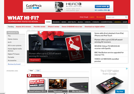
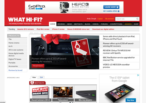
Welcome to the new-look whathifi.com. We’ve given the site a makeover with a new, simpler and fresher design.
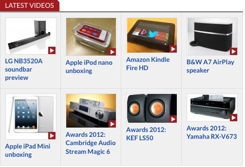
The functionality remains the same, but we’ve added a bigger Carousel and more videos to the Homepage, simplified the use of colours and adopted more modern typography. We've improved in-site search too, so it should be easier to find what you want.
You’ll spot a new ‘trending’ bar at the top of the Homepage, a more prominent position for our latest videos and a simplified structure for our For and Against comments on all the reviews.
We've also added social media buttons giving you quick links to our Facebook, Twitter, YouTube and Google+ pages so you can follow us wherever you are.
And a link at the bottom of the Homepage takes you straight to iTunes where you can get our iPad app and download the digital edition of the mag directly to your tablet.
Don’t forget you can also compare prices and check out the latest deals on the new whathifi.com shop, with ‘Buy Now’ and ‘Available from’ links on many reviews.
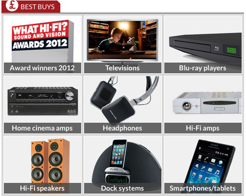
The all-important Awards section and Best Buys remain, and we’ve no doubt you’ll let us know what you think of the new look on the Forums.
Get the What Hi-Fi? Newsletter
The latest hi-fi, home cinema and tech news, reviews, buying advice and deals, direct to your inbox.
We’ll be doing a bit more tweaking over the coming days, so bear with us while we do.
Andy is Global Brand Director of What Hi-Fi? and has been a technology journalist for 30 years. During that time he has covered everything from VHS and Betamax, MiniDisc and DCC to CDi, Laserdisc and 3D TV, and any number of other formats that have come and gone. He loves nothing better than a good old format war. Andy edited several hi-fi and home cinema magazines before relaunching whathifi.com in 2008 and helping turn it into the global success it is today. When not listening to music or watching TV, he spends far too much of his time reading about cars he can't afford to buy.

