HTC One hands-on review: pictures and first impressions
UPDATE: Our full in-depth HTC One review is now online!
The HTC One is finally official. After months of rumours and internet whisperings, HTC unveiled its new flagship handset at simultaneous launches in London and New York – and of course we were there to get a first hands-on look to see how it measures up to the competition.
HTC One: Design
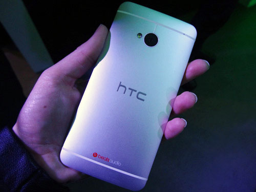
The design of the HTC One feels somewhat refreshing, even if not entirely original. The back has the look and feel of the iPhone 5, while the front bears more than a passing resemblance to the new BlackBerry Z10. That’s not a dig though – it’s our favourite HTC phone design yet, and is a welcome departure from the rather samey design of HTC’s Android phones in recent years.
It’s a unibody contruction, and HTC’s first full metal handset. Just like the iPhone 5, HTC had previously left panels of non-metal – often rubber, but glass in the iPhone 5 – to allow the antenna inside to broadcast and receive signal. New technology has instead allowed HTC to build the antenna successfully into the back panel, creating a more seamless look in the process.
It’s a slim handset too, 9mm at its thickest and 5mm at its thinnest, and there’s an ever so slight curve to it that makes it sit comfortably in your hand. It’s a little heavier than other handsets out there – 143g compared to the iPhone 5’s 112g and Samsung Galaxy S3’s 133g – but it’s hardly a burden, and adds to its feeling of sturdiness.
Get the What Hi-Fi? Newsletter
The latest hi-fi, home cinema and tech news, reviews, buying advice and deals, direct to your inbox.
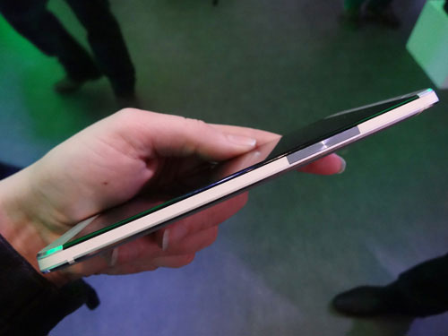
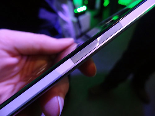
It’s minimal on physical controls, but those it does have are also made of metal, and are flush to the body. You’ll find a rectangular volume control on the right hand side edge and a power button on the left at the top. A micro USB charging port sits at the bottom, with a 3.5mm jack on the top right edge.
HTC One: Display
As is becoming the norm in smartphones now, the screen is a big one – a 4.7-inch LCD IPS display, the same size as the Galaxy S3. But while the S3 can feel a bit cumbersome in smaller hands, we didn’t notice the huge size to be a particular issue.
It offers a fantastic 1920 x 1080 full HD resolution and a seriously crisp 468 pixels per inch (ppi), which we make to be the best pixel density of any phone on the market. As you can imagine, this means it’s fantastically sharp and offers a high-level of detail no matter what you’re doing on the phone. Colours are punchy and bright, black levels were excellent and viewing angles impressive. There were no movies on the handset we tried so we’ll have to wait for a full review sample to judge it on that, but we have high hopes for a great experience.
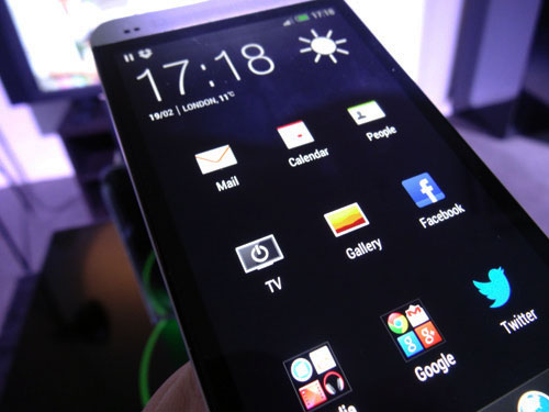
This excellent screen is covered by the latest generation Corning Gorilla Glass to help it withstand the odd knock and drop, and with HTC's ‘zero gaps’ motto on the handset, it seems to melt into the edge of the phone.
HTC One: Performance, storage and connectivity
Performance was seriously impressive from the short amount of time we spent with the handset. Flicking around the various menus was smooth and nippy with not an ounce of lag in sight. This is no doubt thanks to new generation Qualcomm Snapdragon 1.7GHz quad-core processor, supported by 2GB of RAM.
The HTC One will be available in the UK in a 32GB version only, with no microSD card slot for expansion either. As with all phones in the One series, though, you will get 25GB of free Dropbox storage for two years to help ease the burden of your massive mobile library.
As for connectivity, the HTC One will be able to access 4G networks, if you’re on the correct tariff, and also packs NFC, Bluetooth 4.0 and Wi-Fi a/b/g/n/ac.
HTC One: Sense 5.0 and BlinkFeed
A big part of the HTC One is it’s launching with the latest iteration of the HTC Sense user interface, which has always been one of the best UI’s to sit over the top of Android.
Now it’s even better, and HTC has really thought out of the box on how to create a unique experience compared to the plethora of Android devices on the market.
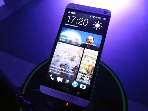
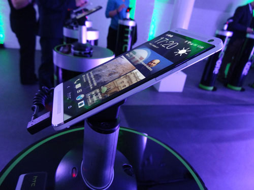
One of the big parts of that is BlinkFeed – a new homescreen for the HTC One. Gone is the huge flip clock and in-your-face weather app, instead replaced by a rather minimalist time and weather hub at the top of your screen, followed by a selection of news stories and snippets of interest in a visual tiled design. You simply scroll to browse and click a tile to read the full story. You can then go back for more highlights, or swipe to the next full story in your feed, quickly and easily.
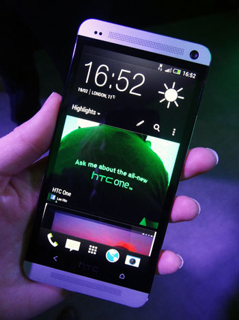
We can certainly see a hint of news aggregation app Flipboard in its design, and maybe a touch of Windows Phone Live Tiles too, and in truth it’s a bit of a mixture of both.
The stories that appear in your BlinkFeed are completely customisable. They can include stories from your favourite newspaper or website – HTC has over 1,000 partners on board at the moment – stories on certain topics, updates from Facebook and Twitter friends, memos, emails and calendar reminders. The idea is that your BlinkFeed is all you’ll need to get a quick snapshot of what’s going on in your world at any given time.
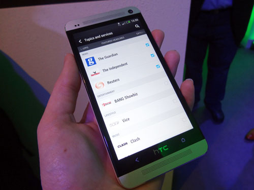
You can choose how often BlinkFeed updates, and save yourself a huge data bill by selecting it to only push new stuff to you when connected to Wi-Fi. You can even turn it off completely and opt for a regular homescreen if it’s not for you, though three standard customisable homescreens are still available when using BlinkFeed by simply flicking to the left.
We’re sure having it constantly updating over 3G would have an effect on battery life, but that’s something we’ll look at in the full review.
Other tweaks to HTC Sense 5.0 include a redesigned app screen, with a new font for a fresh, more minimalist feel, simpler app icons and the ability to change the size of the app grid to fit more or less apps onto each screen. The app tray also allows for folders to sit there now, and there’s a welcome lack of bloatware that has become all too present on a lot of Android handsets.
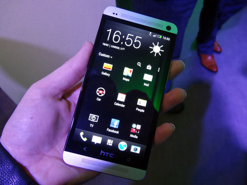
All in all, HTC Sense 5.0 already feels like a success. It provides an interesting and seemingly useful experience not available on any other Android handset, cleverly making it stand out in a very crowded marketplace.
HTC One: Sound quality and BoomSound
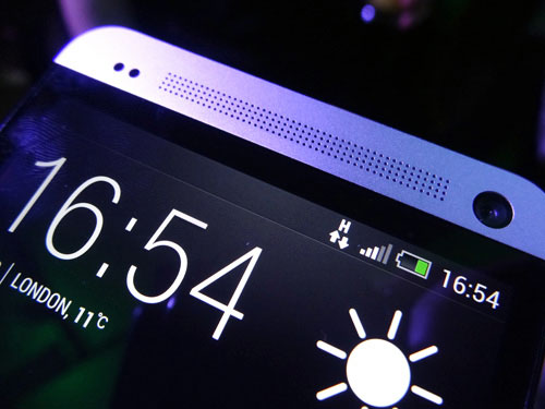
In its announcement of the HTC One, HTC described it as offering “the best audio experience on any mobile phone”, with the main emphasis being on its two front-facing speakers and their rather questionable name of BoomSound.
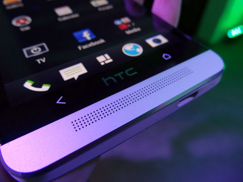
The two BoomSound speakers sit above and below the screen to create a stereo sound experience. HTC says they offer the loudest volume on any smartphone, with no distortion even at high volumes. We tested them in a rather loud room with music blaring, so we couldn’t get a full feel for the quality of sound – though we could still hear Sheryl Crow singing amidst the hubbub, which is promising.
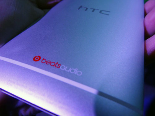
Beats Audio is of course on board too, though you won’t get any Beats headphones in the box. We’d suggest this is somewhat of a blessing – the music demos were with Beats Solo headphones, which gave far too much bias to the low end, leaving vocals lost and treble feeling thin. We plugged in our Sennheiser Momentums and the sound was much more enjoyable, with immediately better balance and more detail.
While the BoomSound speakers were almost definitely the headline feature on the audio side of things, HTC has also made some tweaks to improve sound capture too, using dual membranes on its two built-in mics in order to get full dynamic range. This means recording loud songs at a gig, for example, should playback better and less boomy, and call quality should be improved too.
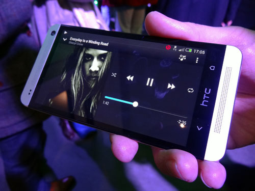
Call quality is further helped by a nice feature that will recognise the ambient noise in a room and dynamically adjust the frequency response and in-call volume without you needing to do a thing, meaning you’re able to hear the caller as clearly as they can hear you.
HTC One: TV
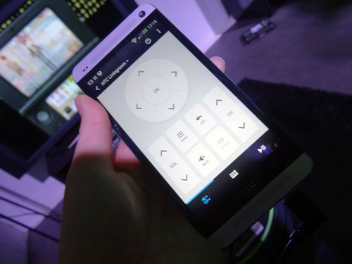
HTC has introduced a new built-in app that allows you to use your phone to control your TV. While there are plenty of apps out there that let you do the same and more, it’s a nice addition to have at your fingertips.
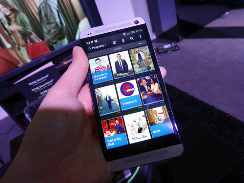
HTC has built the IR eye into the on/off/lock button, and once you’ve set it all up through the TV app, you’ll be able to turn your TV on and off, control its volume and, for Sky, Virgin and Freeview customers, see a visual view of what’s on TV now and next, with a simple touch taking you to that channel. You can even programme your favourite shows in the app, which will send a reminder to your BlinkFeed when it’s nearly time to tune in.
HTC One: Camera
Alongside the sound quality of the HTC One, its camera is the other feature that HTC has made a big point of emphasising. And on paper, as a four megapixel camera, that might seem confusing. However, it’s down to HTC putting its days of ‘pixel-chasing’ behind it, and instead choosing to concentrate on quality.
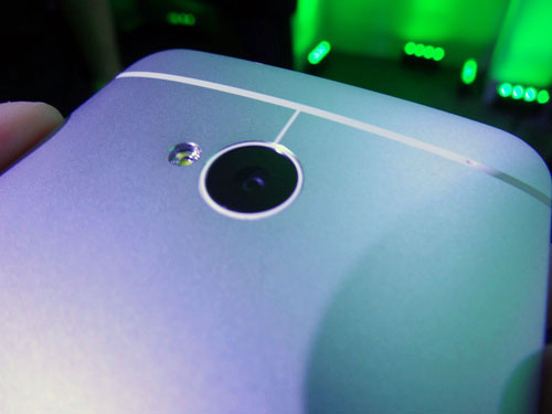
It uses ‘Ultrapixels’ in place of megapixels, which are not only bigger than the pixels found in other phone sensors, but are also said to absorb 300% more light, allowing for more detail and improved low-light snaps too. It features an impressive f2.0 lens, beating the iPhone’s f2.4 offering and putting it on par with the the Nokia 920.
We’ll dig deeper into the camera on our full review but it performed well with the few photos we tried out with it, capturing people zipping around the fairly dimly lit demo area with surprising clarity.
Another headline feature of the camera, is the Zoe (named after the zoetrope). It will take around four seconds of continuous video – including one second before you even press the shutter – and offer around 20 individual frames that can be picked out from that as a still shot.
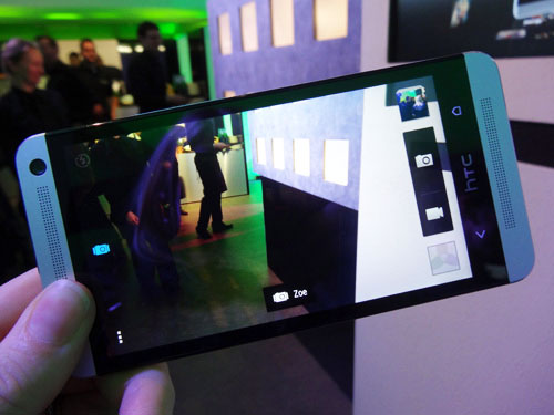
This enables you to do two things. Firstly you are able to edit photos in a rather BlackBerry BB10-esqe way, editing individual faces in a photo to ensure everyone has their best smiles or removing unwanted objects from an otherwise perfect shot.
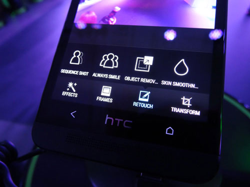
It also allows you to create a live gallery that will play back your Zoes in thumbnails as you scroll through, or alternatively stitch a number of them together automatically using their metadata. You can then edit them with a choice creative effects and soundtracks, and share them via email or on social networks.
HTC One: First impressions and availability
We’ve certainly been impressed with our short time with the HTC One and we’re looking forward to really putting it through its paces with our full review. First impressions suggest it’s a phone that delivers on both the hardware and software front, with nice touches and attention to detail that makes it stand out from the fairly noisy Android crowd. Samsung will certainly have to answer strongly at the rumoured Galaxy S4 launch on 14 March.
UPDATE: HTC One review now online!
by Verity Burns
Verity is a freelance technology journalist and former Multimedia Editor at What Hi-Fi?.
Having chalked up more than 15 years in the industry, she has covered the highs and lows across the breadth of consumer tech, sometimes travelling to the other side of the world to do so. With a specialism in audio and TV, however, it means she's managed to spend a lot of time watching films and listening to music in the name of "work".
You'll occasionally catch her on BBC Radio commenting on the latest tech news stories, and always find her in the living room, tweaking terrible TV settings at parties.

