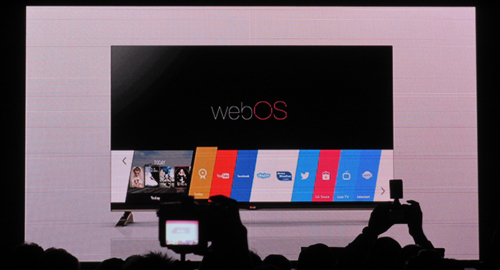
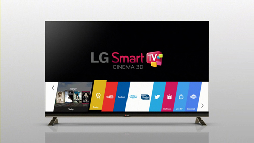
LG has officially unveiled webOS, its new interface aimed at making smart TV a more simple experience. This confirms last week’s leak, which suggested a design overhaul.
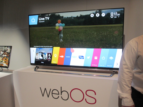
There’s a left-to-right scrolling menu with apps in a sleek line along the bottom, instead of being hidden in separate pages. The left-most box handles recently used apps, and a bigger, more detailed window shows the current channel. That leaves the right side to the future – apps you may care to use later.
Users can switch between broadcast TV, smart content and external media devices without having to return to a home screen or 'hub'. The menu pops up without interrupting your viewing – just like the pop-up menu on Blu-ray discs. This creates a more seamless viewing experience.
It also helps that everything zips along and feels very responsive. It feels more like changing channels on a conventional telly, rather than stuttering through a reluctant computer.
WebOS also has a content recommendation service, offering suggestions of TV shows and feature films based on what's popular with other users. The LG store has also received an overhaul.
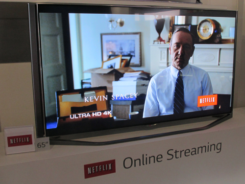
It's no longer just a load of apps: you can also pick programmes from your set-top box, or LG's own library of on-demand content. On LG’s Ultra HD line-up, WebOS will support 4K streaming from Netflix – which tackles the looming issue of the lack of 4K content. Netflix has declared that LG would be the first manufacturer to integrate Netflix 4K streaming, and confirmed that season 2 of House of Cards will stream in 4K this year.
Set-up promises to be easier as WebOS recognises what devices you plug into the TV. You also get help from an animated character named BeanBird, which looks to be the LG equivalent of Microsoft Word’s bouncing paperclip. It's unnecessary, but it's an interesting and fun alternative to a series of plain option boxes.
Get the What Hi-Fi? Newsletter
The latest hi-fi, home cinema and tech news, reviews, buying advice and deals, direct to your inbox.
WebOS previously belonged to Hewlett-Packard, until LG bought it in March last year. The firm promises to put WebOS on at least 70 per cent of its TVs in 2014.
by Ced Yuen
