Deezer updates web interface with focus on recommendations
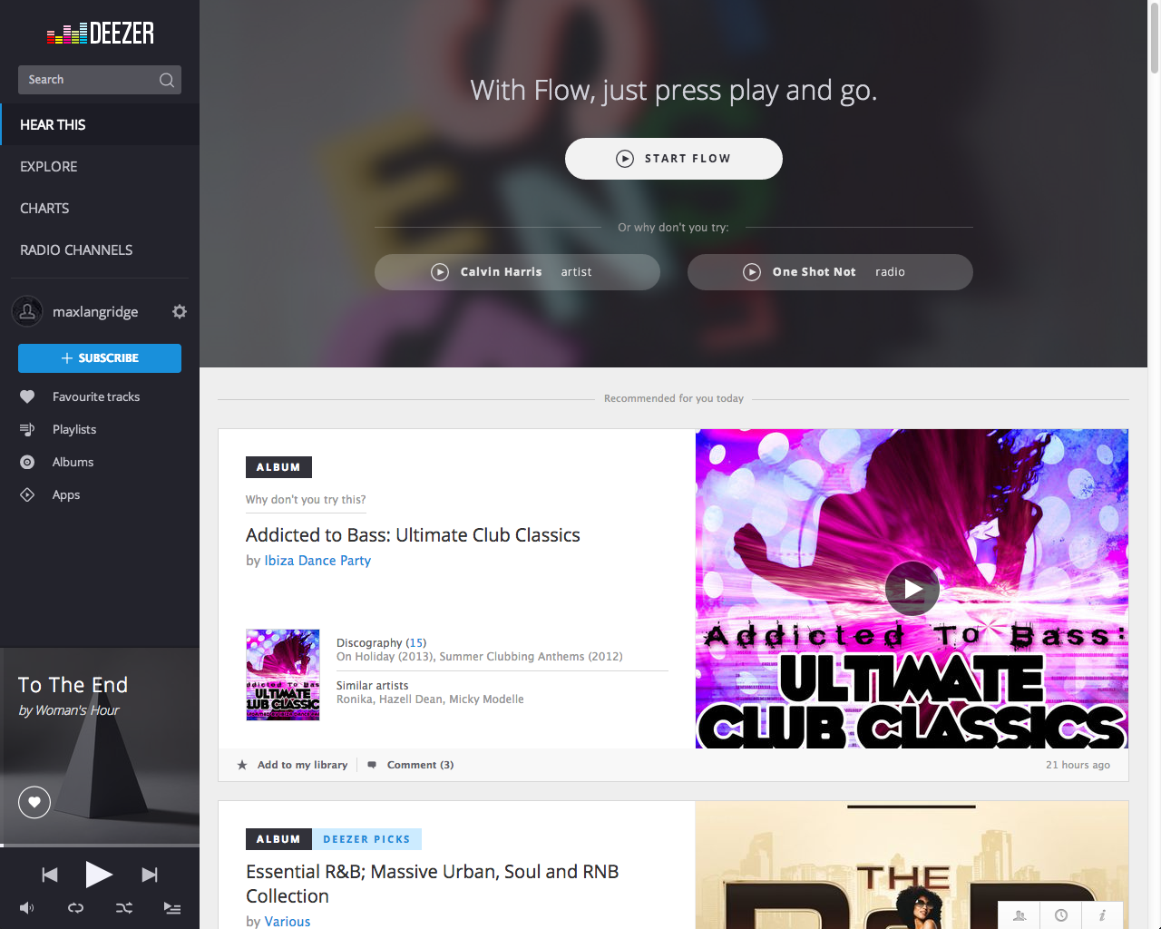
Deezer has announced a new look interface for its web platform. It's designed to look smarter and put music recommendations at the forefront.

The update is a result of usability testing and feedback from Deezer users and will make music recommendations, tailored to each user from the streaming service's 35 million strong catalogue, easier to access.
Deezer's 'Flow' function has been made more prominent and will instantly create a playlist of recommended music for each user.
The new look interface is based on Deezer's tablet app and as such, claims a cleaner, more refined feel. A new sidebar provides quick access to users' libraries and the core features of the music service.
MORE: Deezer review
Personalised welcome screens have been introduced too and provide statistics such as your most listened to tracks, genres and artists, as well as giving playlist and radio suggestions based on your mood or choice of music genre.
Alexandra Croiseaux, VP Product at Deezer, said: "Deezer has built a global audience of over 16 million people, so we have access to a huge amount of usability data, meaning we can adapt the service to the needs of our users.
"We believe our new design is truly smart in terms of both form and functionality, and we are putting the focus squarely on what matters the most - the music."
Get the What Hi-Fi? Newsletter
The latest hi-fi, home cinema and tech news, reviews, buying advice and deals, direct to your inbox.
The new look Deezer interface is live as of today, 1st October.
Max is a staff writer for What Hi-Fi?'s sister site, TechRadar, in Australia. But being the wonderful English guy he is, he helps out with content across a number of Future sites, including What Hi-Fi?. It wouldn't be his first exposure to the world of all things hi-fi and home cinema, as his first role in technology journalism was with What Hi-Fi? in the UK. Clearly he pined to return after making the move to Australia and the team have welcomed him back with arms wide open.

