Amazon Prime Video is getting a redesign – here are its 6 best new features
New look, lots of new features

Amazon Prime Video is getting an overhaul. The streaming service has looked dated for years, especially compared to slicker rivals like Netflix and Disney Plus. But that's all changing.
Starting this week, a new, less cluttered, look is rolling out, along with new features that should make it much easier to use. Here's what's new.
1 New UI

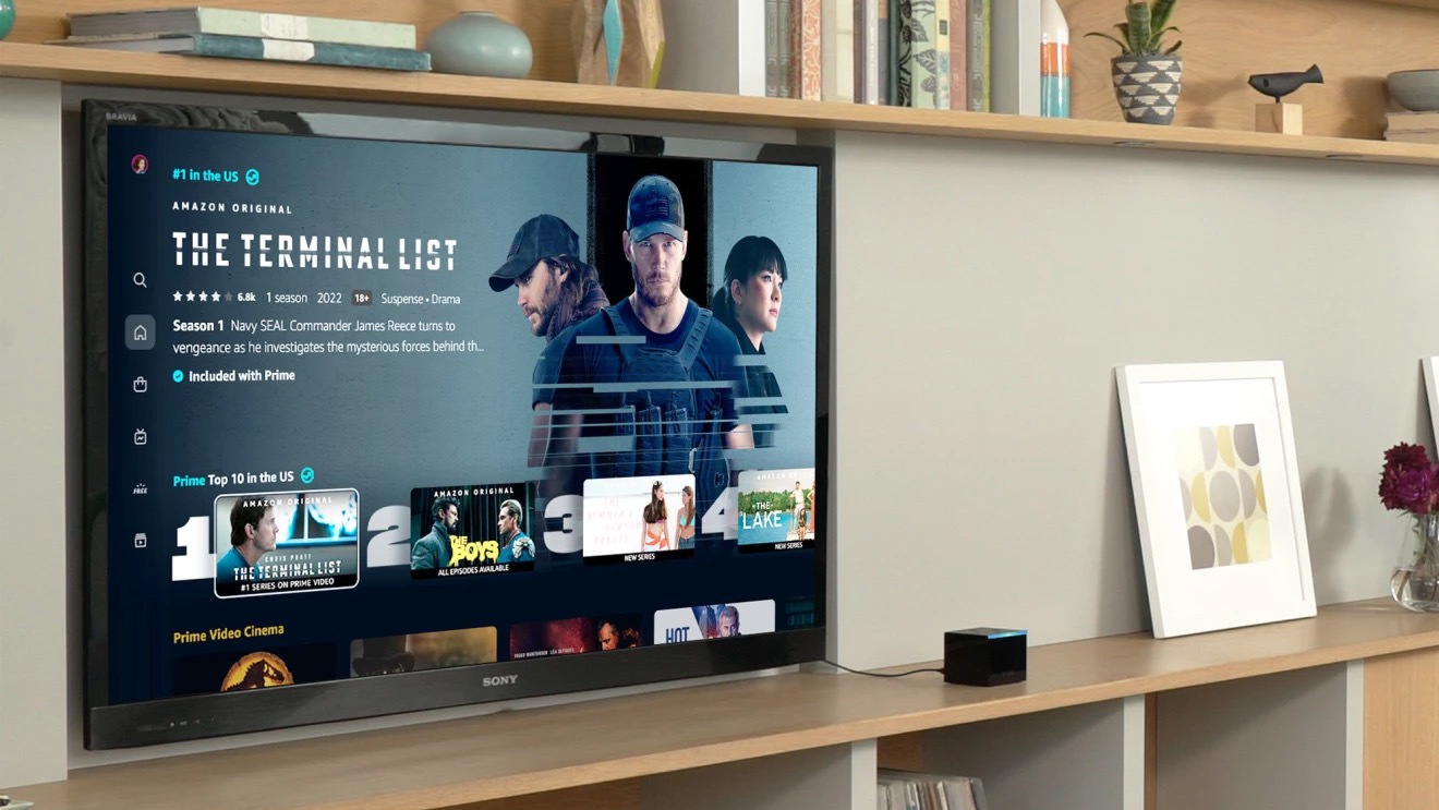
The most significant change is the main menu. It's all been redesigned and re-ordered to look slicker and be more intuitive.
For the living room apps, there's a new navigation menu on the left side of the screen that's straight out of Netflix. This contains six sections: Home, Store, Find, Live TV, Free with Ads, and My Stuff. There are sub-navigation options to browse by content/offer type, such as Movies, TV shows, Sports (all within the Home section), and Channels and Rent or Buy (within Store).
2 Carousels

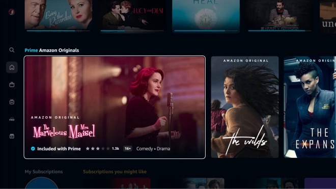
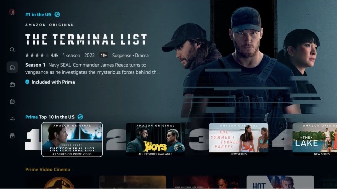
Taking another cue from Netflix, there's a new Top 10 chart that shows what's trending, while the Super Carousel positions content front and centre with large, poster-style artwork. This will be reserved for Amazon Originals, Exclusives and Prime Video Cinema to help them stand out (as anyone who's used an Amazon device will tell you, the firm isn't exactly shy about shouting about its own content).
Hopefully these carousels will help you find something to watch quickly and easily.
3 Clearly marked content

One of the biggest criticisms of Prime Video is that you often can't tell what's included in your membership and what isn't. How frustrating to finally find something to watch after hours of scrolling only to be told you have to pay for it. It's enough to make you throw your Fire TV Stick out of the window.
Get the What Hi-Fi? Newsletter
The latest hi-fi, home cinema and tech news, reviews, buying advice and deals, direct to your inbox.
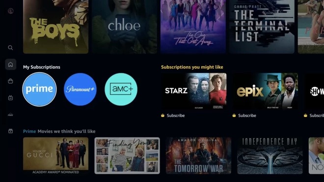
But the redesign should do away with that. Everything that's available to watch on Prime has a blue checkmark icon, while those that you have to pay to rent, buy or subscribe to come with a shopping bag icon. And you can access all videos included in your Prime membership with one click – it's near the top of Home within the My Subscriptions row. Which should mean fewer Fire TV Sticks flung out of windows.
4 New search with 4K
The search function (called Find) claims to "simplify the search experience". You can search for a specific title or browse genres and collections. It'll suggest search terms as you type, and you can filter results by genre or by what's available in 4K (hopefully we'll see the option of HDR added soon).
5 Snazzier visuals
Images are bigger, richer and more immersive, and the whole look has a new colour palette. Combined with the carousels, it makes for a less busy, less crowded look that's less stressful to navigate.
6 Sports in pole position
Sports content is now easier to find, with a Sports sub-menu within the Home section. The new Live TV page also serves as a hub for live streaming, including sports and events.
The Sports menu has carousels of its own to show leagues and teams you've expressed an interest in, and will host sports documentaries and other additional content like replays.
So there you have it. The update is rolling out this week to connected living room devices (like smart TVs and Fire TV devices) and the Prime Video Android app, and should have arrived by the end of the summer. iOS and web devices will follow, though Amazon hasn't said when.
MORE:
Read our Amazon Prime Video review
Amazon Prime Video tips: 4K, HDR, the app and other features
Hopefully now he'll cheer up: Why I hate Amazon Prime Video – and why I keep watching it anyway
Joe has been writing about tech for 20 years, first on staff at T3 magazine, then in a freelance capacity for Stuff, The Sunday Times Travel Magazine (now defunct), Men's Health, GQ, The Mirror, Trusted Reviews, TechRadar and many more. His specialities include all things mobile, headphones and speakers that he can't justifying spending money on.
-
cobraBLACK All I'm really looking for from Amazon Prime is to input my passcode once when I pick the profile - not every single time a new episode starts.Reply
I don't get the excitement with Netflix losing subscribers. That was always going to happen with so many additional services but they still have the best UI (where others are actually terrible in comparison) and they probably have the best content overall too.

