What Hi-Fi? Verdict
The form factor appeals, but the level of performance needs to be better
Pros
- +
Compact
- +
smart
- +
neat syncing features
Cons
- -
Older Android OS
- -
sluggish navigation and web browser
- -
average video and sound
Why you can trust What Hi-Fi?
And still they come, the Android tablet challengers to the Apple iPad crown.
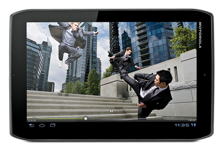
And still they come, the Android tablet challengers to the Apple iPad crown. This is the Motorola Xoom 2 Media Edition (ME),
a smaller, more portable version of the Xoom 2, the company’s flagship tablet.
The Media Edition has an 8.2in screen (compared with 10.1 on the Xoom 2) and weighs in at a considerably lighter 388g (the new iPad is 652g by way of comparison).
The ME is cut from the same cloth as its bigger brother, with lopped-off corners, a slender 8.9mm chassis and a glossy screen. The gloss black trim around the screen looks smart, but both it and the screen itself attract smudges and are fairly reflective.
Otherwise it’s nicely put together and comfortable to hold. The smaller chassis means a shorter battery life, however, so we’re down to around six hours for web browsing and/or video.
Decent file format support
The 8.2in TFT IPS screen has a 1280 x 800 resolution and is capable of playing 1080p video or recording 720p HD video from the 5MP rear camera (there’s a lower res 1.3MP front camera, too). File format support is standard, with H.264, WMV and MP4 video, and AAC and MP3 music files catered for.
The Android 3.2.2 operating system is now last generation. An update to Android 4.0 (Ice Cream Sandwich) is promised (and has rolled out for the original Xoom) but not until this summer. Still, you get the same access to the Google Play store for apps, books and games, plus movies to buy or rent.
Motorola’s MotoCast software allows for wireless syncing between your computer and tablet. The software is intuitive and works nicely. You can still drag and drop, and connect via USB, while there’s a mini HDMI video out and Bluetooth support too.
Just a touch off the pace
The action of the device in use, so crucial to your enjoyment of the tablet experience, does feel a fraction off the pace at times. There’s a slight but noticeable pause when you open up an app. An update to the Android OS could speed that up, though, and otherwise the familiar Android interface is nicely presented.
With a screen that’s the same resolution as many of the larger tablets, video looks sharp and bright. We browse the BBC iPlayer and load up some video. Again, internet speeds are a little slow and
picture quality is a little blocky.
Purchased HD video content is much more impressive, responding to the better source material with a clean image and bright colours. Some fine detail and a layer of overall subtlety is missing, however, compared with other tablets on the market.
It’s a similar story with audio. The XX sound a little brighter than they should, while Dry The River’s meanderings don’t muster up the insight to keep us interested.
We like the form factor and in isolation the Xoom 2 Media Edition takes care of much of the usual tablet tasks well
enough. But it’s a competitive market,
and ‘well enough’ isn’t quite good enough.This is the Motorola Xoom 2 Media Edition (ME), a smaller, more portable version of the Xoom 2, the company’s flagship tablet.
The Motorola Xoom 2 Media Edition has an 8.2in screen (compared with 10.1 on the Xoom 2) and weighs in at a considerably lighter 388g (the new iPad is 652g by way of comparison).
The ME is cut from the same cloth as its bigger brother, with lopped-off corners, a slender 8.9mm chassis and a glossy screen.
The gloss black trim around the screen looks smart, but both it and the screen itself attract smudges and are fairly reflective.
Otherwise it’s nicely put together and comfortable to hold. The smaller chassis means a shorter battery life, however, so we’re down to around six hours for web browsing and/or video.

Motorola Xoom 2 ME: Tech specs
The 8.2in TFT IPS screen has a 1280 x 800 resolution and is capable of playing 1080p video or recording 720p HD video from the 5MP rear camera (there’s a lower res 1.3MP front camera, too).
File format support is standard, with H.264, WMV and MP4 video, and AAC and MP3 music files catered for.
The Android 3.2.2 operating system is now last generation. An update to Android 4.0 (Ice Cream Sandwich) is promised (and has rolled out for the original Xoom) but not until this summer.
Still, you get the same access to the Google Play store for apps, books and games, plus movies to buy or rent.
Motorola’s MotoCast software allows for wireless syncing between your computer and tablet.
The software is intuitive and works nicely. You can still drag and drop, and connect via USB, while there’s a mini HDMI video out and Bluetooth support too.

Motorola Xoom 2 ME: Performance
The action of the device in use, so crucial to your enjoyment of the tablet experience, does feel a fraction off the pace at times.
There’s a slight but noticeable pause when you open up an app. An update to the Android OS could speed that up, though, and otherwise the familiar Android interface is nicely presented.
With a screen that’s the same resolution as many of the larger tablets, video looks sharp and bright.
We browse the BBC iPlayer and load up some video. Again, internet speeds are a little slow and picture quality is a little blocky. Purchased HD video content is much more impressive, responding to the better source material with a clean image and bright colours.
Some fine detail and a layer of overall subtlety is missing, however, compared with other tablets on the market.
It’s a similar story with audio. The XX sound a little brighter than they should, while Dry The River’s meanderings don’t muster up the insight to keep us interested.
Verdict
We like the form factor and in isolation the Xoom 2 Media Edition takes care of much of the usual tablet tasks well enough.
But it’s a competitive market, and ‘well enough’ isn’t quite good enough.
What Hi-Fi?, founded in 1976, is the world's leading independent guide to buying and owning hi-fi and home entertainment products. Our comprehensive tests help you buy the very best for your money, with our advice sections giving you step-by-step information on how to get even more from your music and movies. Everything is tested by our dedicated team of in-house reviewers in our custom-built test rooms in London, Reading and Bath. Our coveted five-star rating and Awards are recognised all over the world as the ultimate seal of approval, so you can buy with absolute confidence.

