What Hi-Fi? Verdict
Best universal remote, Awards 2011. Yet another swish remote from the chaps at Harmony
Pros
- +
User-friendly operation and simple menu system
Cons
- -
Touchscreen functionality would be nice
Why you can trust What Hi-Fi?
The problem for Logitech's more expensive remotes is that the software used to set them up is identical to that of the cheaper 555.
It's the main draw of the Harmony range – a substantial yet brilliantly intuitive setup that correctly identifies even the newest products without any trial-and-error testing of codes.
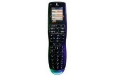
Luckily, the One justifies its premium with a sleeker, more ergonomic design, a vibrant, full-colour touchscreen, and a dedicated charge cradle.
And this model is also now designated Harmony One+, indicating you can use it with the new MyHarmony.com web interface. But then you can use the nonplussed(!) One with the same interface, so...
Admittedly we're not keen on the decision to move the colour buttons from the chassis to the screen (they're out of the way too much considering how frequently they're used), but that's the only downside.
Sponsored Link - Buy this product from Amazon
The latest hi-fi, home cinema and tech news, reviews, buying advice and deals, direct to your inbox.
What Hi-Fi?, founded in 1976, is the world's leading independent guide to buying and owning hi-fi and home entertainment products. Our comprehensive tests help you buy the very best for your money, with our advice sections giving you step-by-step information on how to get even more from your music and movies. Everything is tested by our dedicated team of in-house reviewers in our custom-built test rooms in London, Reading and Bath. Our coveted five-star rating and Awards are recognised all over the world as the ultimate seal of approval, so you can buy with absolute confidence.


