Why you can trust What Hi-Fi?
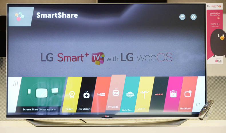
Last year, LG made waves in the smart TV arena. Its slick WebOS interface provided a refreshing alternative to the stagnant ‘hub’ designs, and we praise it every time we use it. Now LG has come up with WebOS 2.0. We got a chance to play with it at CES 2015.
First, a recap of the original WebOS. It centres on the Launcher bar, an overlay like the pop-up menu of Blu-rays, which gives you options without actually interrupting whatever you’re watching. The bar offers a series of colourful cards. The largest card shows you your current content. To the left are recently accessed apps. To the right are all the other sources you might want to use later.
A smart, motion-sensitive remote gives you an on-screen cursor, which you use to click your way around. The system can multitask: you can jump from live TV to web-based content and back as easily as changing channels. LG has wisely decided not to mess with a winning formula too much. WebOS 2.0 offers small tweaks, not sweeping changes. At first glance, the differences are hard to spot.
Speed
The most notable improvement is a boost to the speed. LG claims boot time has been reduced by up to 60 per cent, and we believe them.
Where previously it could take anywhere up to 30 seconds, we managed to go from standby to full speed in around ten. App loading also seems to take half as long as previously.
My Channels
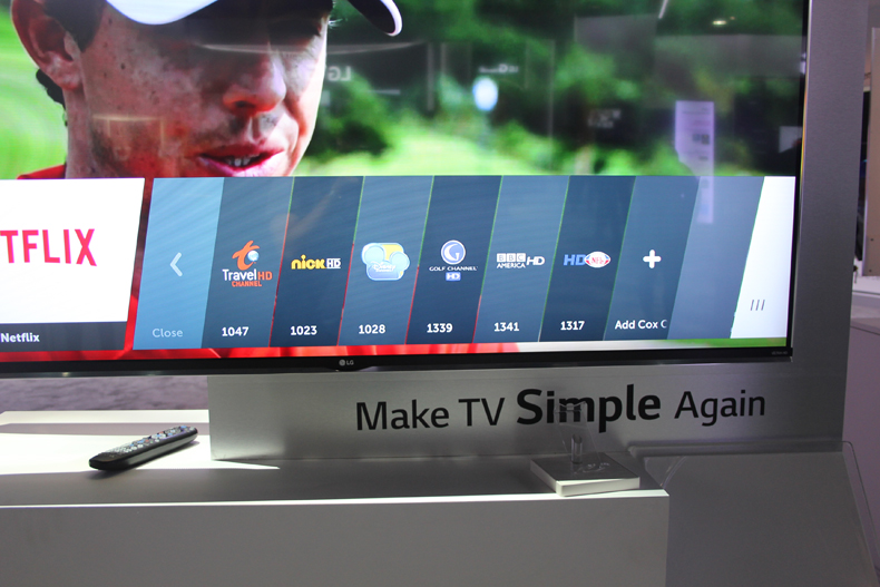
There’s a new card in the Launcher, and it’s called My Channels. This lets you add your favourite channels and group them under one shortcut. You can add set-top box channels as well as regular TV ones. No need to press numbers anymore!
New remote
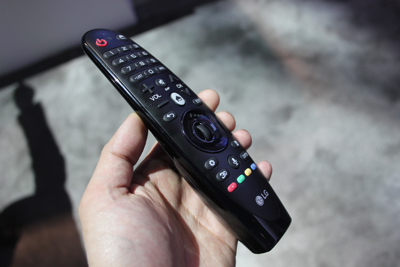
If you do like pressing numbers, however, you can. There’s an updated smart remote with physical number keys. It’s a welcome step back from the trend of oversimplified smart remotes that merely give you on-screen numbers to (exhaustingly) point at.
So now you have fancy motion-sensitive pointing convenience as well as old school button punching. Bliss.
Quick settings
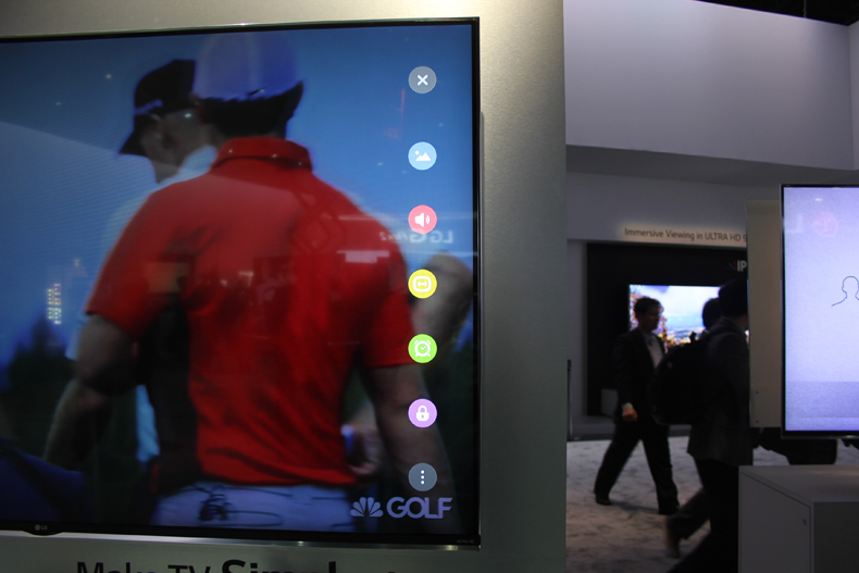
The way you adjust settings has also been tweaked. Where previously the settings were necessarily part of a full menu, now there are shortcuts designed to take you straight to mess with the picture or sound.
Press the settings button and a bunch of icons will appear. Like the Launcher, these icons sit on top of whatever you’re watching – without interrupting. No need to pause just to bump up the brightness a notch.
There’s also an ‘Input Picker’ bar, which can be pulled down from the top of the screen. This removes the need to backtrack through menus – one less step between you and other inputs.
Verdict
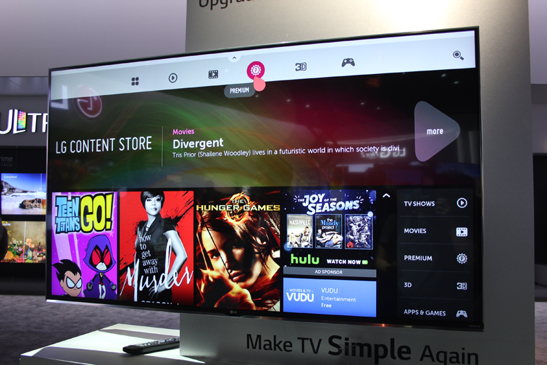
From our limited play time with WebOS 2.0, it already appears to be a simpler, slicker, and more intuitive offering than the original we knew and loved. WebOS 2.0 will run on all of LG’s 2015 TVs, and we can’t wait to test it properly.
What Hi-Fi?, founded in 1976, is the world's leading independent guide to buying and owning hi-fi and home entertainment products. Our comprehensive tests help you buy the very best for your money, with our advice sections giving you step-by-step information on how to get even more from your music and movies. Everything is tested by our dedicated team of in-house reviewers in our custom-built test rooms in London, Reading and Bath. Our coveted five-star rating and Awards are recognised all over the world as the ultimate seal of approval, so you can buy with absolute confidence.
What is a hands on review?
'Hands on reviews' are a journalist's first impressions of a piece of kit based on spending some time with it. It may be just a few moments, or a few hours. The important thing is we have been able to play with it ourselves and can give you some sense of what it's like to use, even if it's only an embryonic view.
