What Hi-Fi? Verdict
There’s plenty to like here, but the audio and video can’t match the design quality
Pros
- +
Classy
- +
individual interface
- +
interesting apps
- +
good DLNA integration
- +
fast web access
Cons
- -
So-so audio and video
- -
lower resolution screen is noticeable
Why you can trust What Hi-Fi?
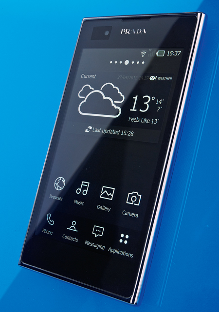
You don’t slap “Prada” on any slab of phone, darling, so while this one is no slouch, it’s got its work cut out.
But specs can, of course, be misleading... The LG Prada 3.0 is a good size thanks to a manageable (if slightly stingy 800 x 480-pixel) 4.3in screen.
It runs the last-generation Android operating system, 2.3, though it’s not alone in that regard, and has a 1GHz dual core processor which, again, is nothing to write home about.
There’s an 8GB internal memory, plus a microSD card slot for adding up to 32GB more, as well as an 8MP, HD video-capable camera with LED flash.
It’s an angular design but with nicely rounded corners and smooth edges, and feels solidly put together. The rear casing has a mottled effect which looks and feels good and has the practical effect of making the phone easier to grip.
LG Prada 3.0: Head-turning interface
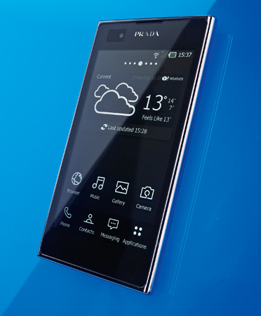
All told, it’s a tidy package, worthy of the name.The most instantly striking nature of the interface is that it’s monochrome.
All of LG’s own apps and icons are white outlines and text. At first glance, and with a plain black background, it looks cool, if a little confusing.
LG opts for four key touch controls at the foot of the device for settings, home, back and a direct Google search button, which is a neat idea.
Above that it’s more familiar, with seven home screens and the usual selection of apps and widgets.
The Prada is nippy when it comes to loading pages. It doesn’t zoom in to or reformat text quite as quickly or cleverly as others at times, though.
Text could appear a little bolder, too. It struggles to cling on to the coattails of the latest smartphones when it comes to video playback, too: the screen’s lack of resolution betrays itself here.

LG Prada 3.0: Video and sound
Skin tones are natural and bright whites are good, but edges aren’t quite as sharp as we’d like, and detail isn’t too realistic.
The LG struggles to deliver the insight necessary during low-lit scenes, and fast motion can cause a slight wobble.
LG puts its spin on the Music app, adding one-touch buttons to ‘SmartShare’ to a DLNA device, add tracks to a playlist, set them as a ringtone and more.
There’s a virtual surround option, too, though it made the sound a little tinny. In isolation the Prada sounds fine. there’s punch, decent clarity and a fair hit of bass.
Compared with the best in class, though it isn’t quite up to standard, missing a little dynamic excitement and detail.
LG Prada 3.0: Camera
The camera proved capable enough, delivering fine images and, just as importantly for a smartphone camera, proving easy to use thanks to that shortcut button, which also doubles as a shutter.
It didn’t enjoy darker scenes as well as some but it’s not alone on that regard. Video was capable, if a little jerky.
We thought the battery life would be better due to the lower spec but the thin chassis houses a relatively small unit, which proved good for a day or so before demanding juice. Still, we’ve no moans with call quality.
Verdict
It all started so well for the Prada, but unfortunately the level of performance didn’t quite keep its end up when it came to video and audio.
It looks great and the interface, while an opinion-splitter, is no doubt eye-catching.If your requirements are more basic but you want something with individual style, this could be for you.
If you want a multimedia powerhouse, you’ll find a little more substance – if arguably in a less stylish package – elsewhere.
See all our smartphone Best Buys
What Hi-Fi?, founded in 1976, is the world's leading independent guide to buying and owning hi-fi and home entertainment products. Our comprehensive tests help you buy the very best for your money, with our advice sections giving you step-by-step information on how to get even more from your music and movies. Everything is tested by our dedicated team of in-house reviewers in our custom-built test rooms in London, Reading and Bath. Our coveted five-star rating and Awards are recognised all over the world as the ultimate seal of approval, so you can buy with absolute confidence.


