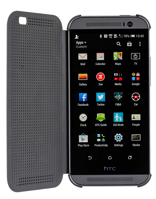
What Hi-Fi? Verdict
As gorgeous on the inside as it is on the out, the One (M8) doesn’t put a foot wrong, which makes it a very desirable handset indeed
Pros
- +
Flawless functionality
- +
Superb build
- +
Fantastic picture quality
- +
Nice screen
- +
Boomsound speakers work well
Cons
- -
Photos lack fine detail
- -
Music could time better
Why you can trust What Hi-Fi?
It’s fair to say the HTC One M8 has some pretty big shoes to fill.
The original HTC One was one of our favourite phones of last year, and we weren’t the only ones thinking that – it received five-star praise from just about every tech magazine, website and blog the world over.
The great news is, its successor is even better.
Design
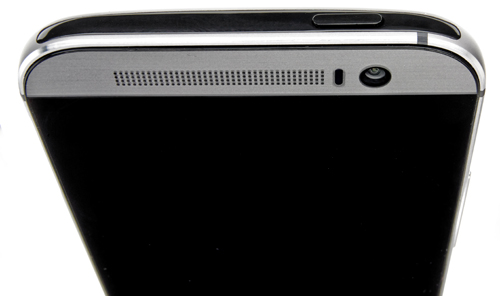
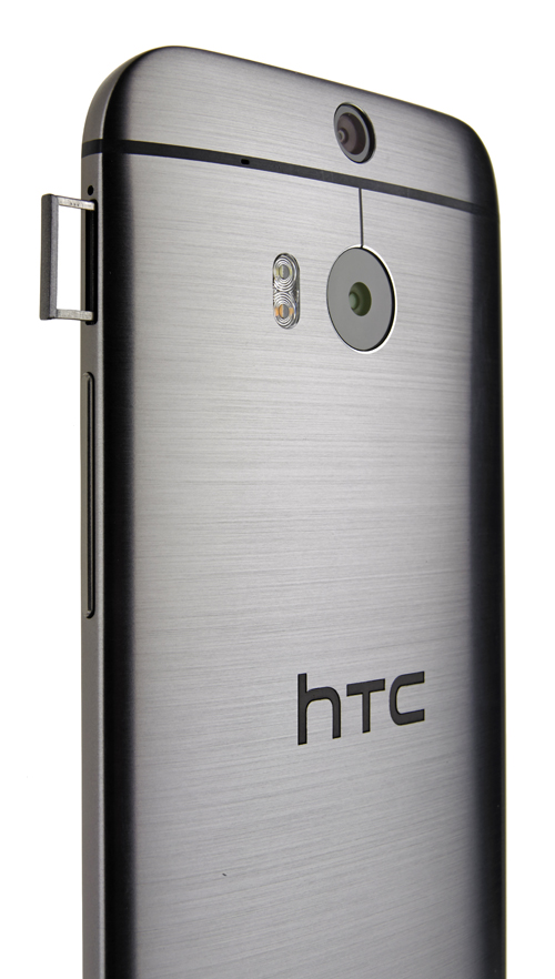
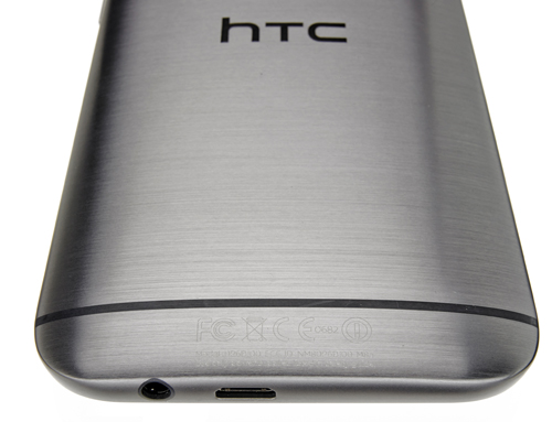
Pick up the One M8 and you know you’re dealing with quality. Just hand it over to someone and watch their expression as they flip it over in their hand – it certainly sets the bar for what a high-end phone should look and feel like.
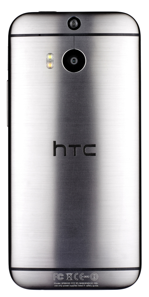
As with its predecessor, it’s created from a piece of single aluminium.
But if you think that’s impressive… the One M8 body is now around 90 per cent metal (an increase from around 70 per cent metal in the original One).
And it shows. There’s next to no plastic to be seen, with the metal edge curving all the way around to meet the screen on the front.
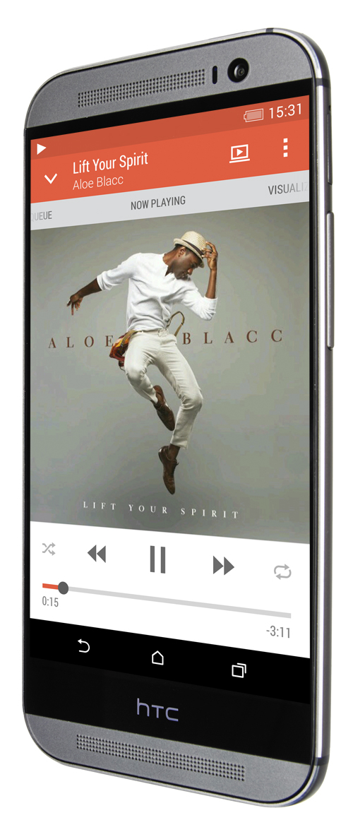
The way it looks has been slightly tweaked too, with curvier corners than before, and a gorgeously rounded-back-panel that has been tapered at the edges to make it easier to hold. As a result, it feels slimmer too, despite having the same 9.4mm depth.
Put simply, it’s the best-looking phone we’ve ever seen. If you’re keen to have a phone that looks as premium as its price tag, the HTC One M8 is certainly the one, putting the Samsung Galaxy S5 to shame.
The flagship colour will be the metal grey we tested, though arctic silver (similar to the original One) and amber gold versions will also be available.
Of course, while we love a beautiful design, it’s what’s on the inside that counts, and luckily the HTC One M8 doesn’t let us down there either.
Specs
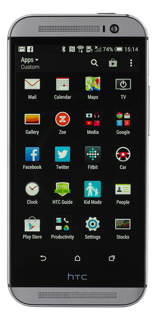
Under the hood, there is a 2.3GHz Qualcomm Snapdragon 801 processor, supported by 2GB RAM. The Galaxy S5 may just pip it on paper for processor power, but the HTC One M8 is as fast as we could wish it to be.
We worked it hard: running multiple apps, whizzing around the operating system and opening numerous data-heavy webpages, but it kept up at every stage without a single stutter or stumble.
Sitting over the top of Android 4.4 (KitKat) is HTC’s newest iteration of its Sense user interface, and it looks as lovely as ever.
If we had to opt for something other than vanilla Android, HTC’s Sense skin would be it.
There has not been a whole host of changes in the way it looks, give or take a few font tweaks. It still has the beautifully clean, unobtrusive design we love, with very little bloatware pre-installed, which is welcome.
Blinkfeed, HTC’s content aggregating homepage, is back, with some design and usability tweaks so it looks better, scrolls smoother and is even more useful than before, adding new features like the ability to create ‘Bundles’ – a single tile that will pull together all the news on a certain topic, so it’s easier to keep up.
Adding to and customising your Blinkfeed is easier than ever too, so you really can turn it into a snapshot of all the things that matter to you.
There’s also now the option to turn it off completely as well, if you are not a fan.
A new software feature on the One M8 is Motion Launch, which offers gesture-based commands. Like the LG G2, you can now wake the screen by simply double tapping, but that’s not all.
They also include swipe up to unlock, swipe right to go straight to Blinkfeed and turn it landscape and press the volume key to launch the camera. You will need to put in any lock codes first though.
We found them to be responsive and work well during testing, with some, particularly the tap to wake becoming second nature before we realised.
Screen
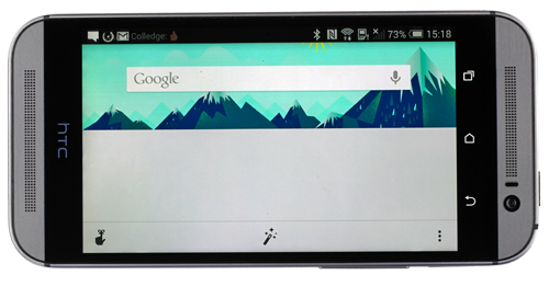
Let’s talk about that One (M8) screen. Up from 4.7in to 5in, the phone is bigger than its predecessor, but not awkwardly so.
It’s taller, for sure, but in the hand it doesn’t feel much different – but then we’d take a bit of extra bulk for the screen here anyway.
With 441 pixels per inch, its display is sharp, has a vivid colour palette, oily blacks and brilliant whites. Samsung's S5 is even blacker and Sony's Xperia Z2 has more detail but the (M8) still has the wowo factor.
It uses a similar panel technology to an IPS (in-plane switching) display, which means viewing angles are really good, too and manage to cling onto colour vibrancy and those impressive black levels, even when viewed off axis.
Those extra few inches on the screen really help to make this feel like a great size for watching movies on the go too.
While there was once a time that a 5in screen felt too big for daily use, now, somehow, it feels just right.
When it comes to storage of all those movies, many might be put off by the single 16GB on-board storage option available in the UK.
Features
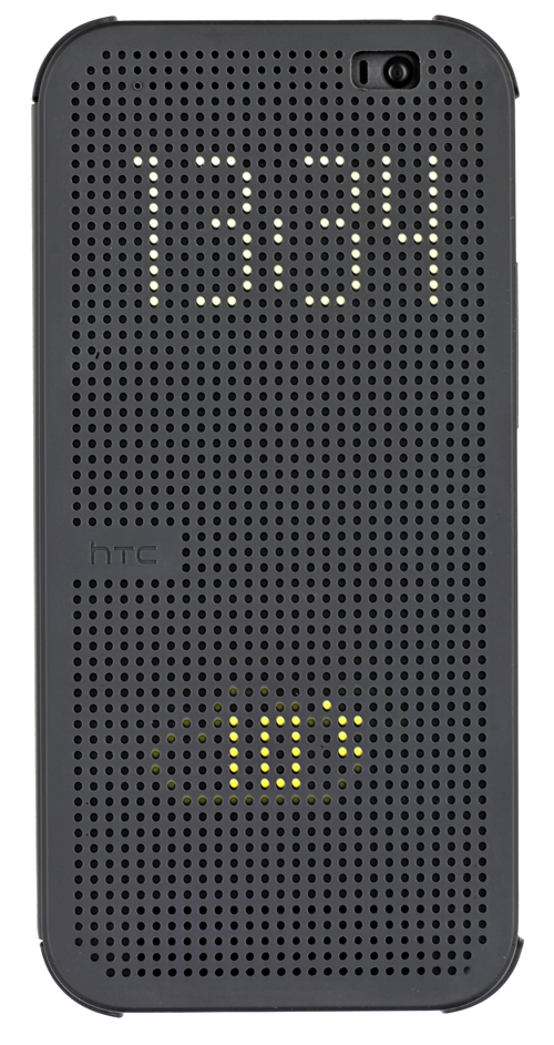
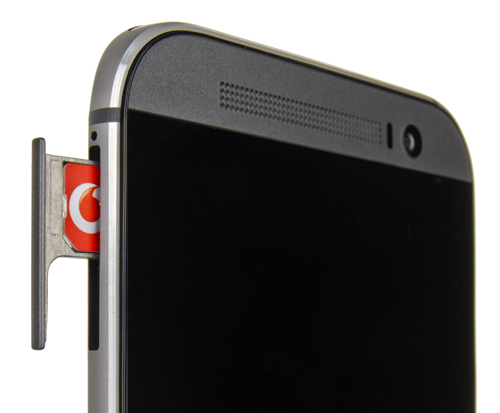
The good news is that HTC has listened to the criticisms of its predecessor and included a microSD card slot here, capable of boosting the memory by a massive 128GB, instantly turning it into a multimedia powerhouse. That is really quite something.
That’s not the only criticism HTC has listened to either. The left hand side placement of the power button was another grumble from the original, and it’s now switched to the right for easier access. Sometimes it’s the small things.
Sound quality
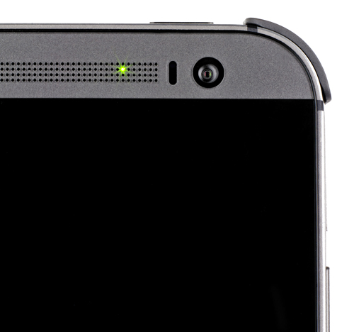
When it comes to sound, HTC has not rested on its laurels. The Boomsound stereo speakers that sit above and below the screen have had their speaker chambers redesigned, allowing the One M8 to be 25 per cent louder than its predecessor.
There’s also a redesigned ‘multi-phase’ amp, which allows the One M8 to amplify different parts of a track independently, giving it the ability to boost soft vocals without overdoing the bass, for example.
There are improvements to be heard here, particularly through the Boomsound speakers. Sound is noticeably louder, there’s better stereo separation and detail levels are up as well.
Voices are clearer and there’s decent weight here too, dodging the thin, tinny sound you will hear from most other smartphone speakers.
Plug in a pair of headphones and the improvements are subtler. It’s a full-bodied, well-balanced sound with decent levels of detail, but it doesn’t quite top the very best from the Sony Xperia Z1 and the iPhone 5s when it comes to timing.
You’ll get slightly more punch from Sony’s handset too and the iPhone is a touch more precise, but it’s an overall perfectly listenable sound that should see you right for sound on the go.
We’d give the Boomsound feature a miss when using headphones though. This has replaced the Beats Audio setting and does a similar job, boosting the bass but losing detail and adding a slight harshness to the treble in the process.
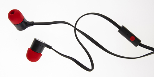
And don’t even bother with the included headphones if you want to make the most from your music – we found them to make the sound thin, hard and bright, with a poorly controlled low end to boot.
Camera
One of the big talking points of the HTC One was its camera shunning of megapixels for Ultrapixels – bigger pixels that HTC claim catch more light for an improved low light performance.
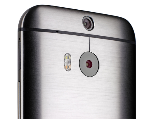
The 4.1-Ultrapixel lens returns here; slightly tweaked but largely the same, and is joined by a second lens, which HTC has dubbed the Duo Camera.
That’s slightly misleading, as it isn’t capable of taking snaps, but instead does the job of capturing all the depth of information of every shot, allowing you to adjust the focus of the photo after the fact, from the edit menu, and bring a rather artsy blurred background effect to your photos (known as bokeh).
During testing we found the Ufocus effect to work best in situations where things were very obviously in the foreground and background.
This way, the camera could judge the item that needed to be in focus a little more – but we often got blurred edges when things were a little less obviously defined, which ruins the effect somewhat.
This depth information allows for a handful of other features, all of which feel infinitely more gimmicky, including the ability to replace the bokeh effect with a handful of dramatic filters.
In regular snapping mode, there’s no getting away from the fact that the HTC One M8 suffers from lack of resolution.
Pictures lack the depth and detail that comparable snaps do on the iPhone 5s, for example, and there are occasional hiccups with over exposure in variable light conditions too.
However, it does snap and focus photos extremely quickly, and in good lighting conditions, you will get good photos generally, with a natural, well-balanced colour palette.
Low-light performance is more of a mixed bag, with a fair amount of noise in snaps once light dips under best conditions.
The good news is that HTC has included an improved twin-tone flash, similar to that on the iPhone 5s, that does a good job at capturing more natural colours and skin tones when in use, so you don’t get that bleached-out effect generally associated with flash smartphone snaps.
Battery
When it comes to battery life, the HTC One M8 does perfectly fine, but doesn’t push boundaries.
There’s a large 2600mAh battery, an improvement from the original’s 2300mAh, which we found lasted the day (about the same as its predecessor).
What has changed is the introduction of the Extreme Power Saving mode, which can help if you get caught without a charger.
By just giving you access to core functionality, this mode can give you up to 30 hours of standby time with just 10 per cent battery remaining; handy indeed.
Verdict
HTC has taken something great and made it even better. The One (M8) eclispses its predecessor, tidying up on an already superb phone.
This is easily one of the best Android phones money can buy.
What Hi-Fi?, founded in 1976, is the world's leading independent guide to buying and owning hi-fi and home entertainment products. Our comprehensive tests help you buy the very best for your money, with our advice sections giving you step-by-step information on how to get even more from your music and movies. Everything is tested by our dedicated team of in-house reviewers in our custom-built test rooms in London, Reading and Bath. Our coveted five-star rating and Awards are recognised all over the world as the ultimate seal of approval, so you can buy with absolute confidence.
