Soundbars need decent displays – a phone app isn’t enough
If soundbar makers improved this one aspect, it would go a long way

Soundbars represent a nice compromise. In an idealistic world of home cinema where budgets are bountiful and rooms are grand and spacious, an AV amplifier and a full surround sound system would be the way to go. Alas, this is usually not the case, so options like soundbars fill the void. And they manage to do a decent job when it comes to sound, but there's one thing that constantly bothers me about soundbars – their displays (or lack thereof).
Soundbar manufacturers often manage to improve the overall performance of their products year on year. A recent example of this is the Samsung Q990D system, which includes a main soundbar along with a subwoofer and a pair of surround speakers. The previous model, the Q990C, earned four stars when it came through our testing rooms for review – not bad at all. The new Q990D managed to top that, earning the full five stars for its improved and refined sound quality, despite being very similarly constructed.
One thing that was not improved, however, was the display. It uses the same dot-matrix design as the previous model, displaying just three characters at once. This means you have to wait for the display to scroll across the names of settings and controls if you adjust anything with the system’s included remote control, making a simple operation slower than it needs, or worse, rendering the remote completely impractical.
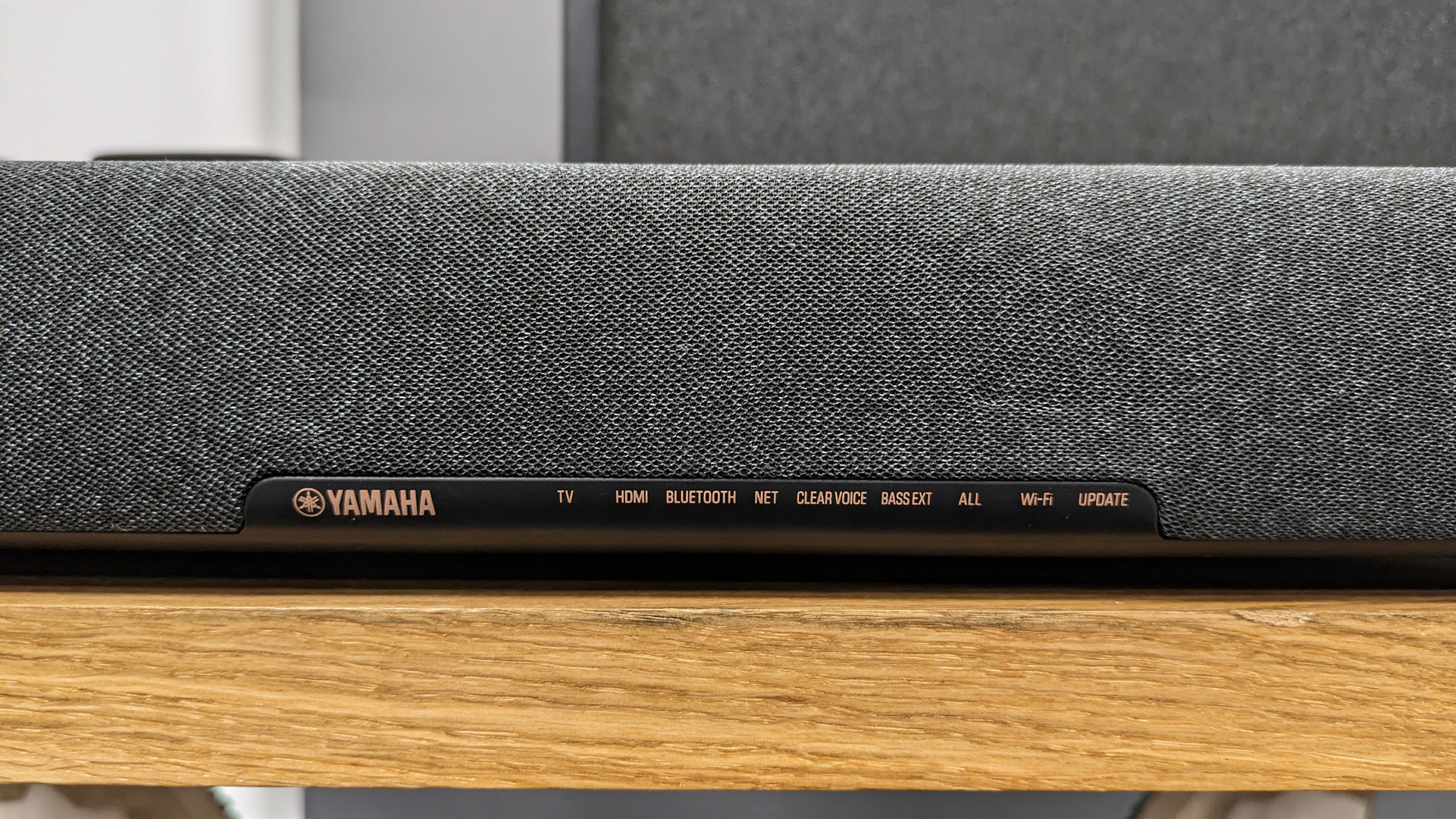
The Q990D is far from the only offender, though. For example, the Yamaha True X soundbar doesn’t even have a display to read. A row of lights with small label text comprise the display, meaning you effectively have to memorise what each light indicates as the labels are unreadable from any reasonable seating distance.
Even the impressive Sonos range of soundbars – the Ray, Beam, and Arc – lack a display and feature only simple status lights. This hasn't hindered their ratings, but it's something they could certainly improve.
As a result of these issues, you will end up using the mobile app to change anything beyond volume when using a soundbar – and this is a problem. Ideally, I don’t want to be on my phone at all when I’m watching a show or a movie. It’s something I’m quite conscious of and do my best to avoid for obvious reasons; I want to dedicate my attention to what I see on screen and hear around me. On top of this, phones are enough of a distraction in day-to-day life as it is.
One argument for the small, limited displays we tend to see on soundbars could be that the manufacturers are doing their best not to distract us visually, but if I end up at the mobile app, that’s a far more obtrusive diversion of my attention.
Get the What Hi-Fi? Newsletter
The latest hi-fi, home cinema and tech news, reviews, buying advice and deals, direct to your inbox.
Taking a quick look at most AV amps counters that argument as well. Even more affordable models like the Denon AVR-X2800H include tidy, comprehensive displays that display information clearly and don’t seem to distract us (and they can be set to automatically dim or turn off after a short period of inactivity), so why can’t soundbars follow suit? After all, we’re talking about models of ‘bar included in systems easily pushing the £1000 mark, not cheaper entry-level units.
If you’re like me, you want to spend as little time on your phone as possible, especially during movie night. Come on soundbar makers, your apps are lovely and all, but I’d rather be watching the show.
MORE:
This week: celebrating Home Cinema Week on What Hi-Fi?
It might not have Dolby Atmos, but my local indie cinema is still my favourite place to watch movies
Ainsley Walker is a staff writer at What Hi-Fi?. He studied music journalism at university before working in a variety of roles including as a freelance journalist and teacher. Growing up in a family of hi-fi enthusiasts naturally influenced his interest in the topic. Outside of work, Ainsley can be found producing music, tinkering with retro tech, or cheering on Luton Town.
