JBL’s smart case for wireless earbuds is fun – but I don't think Apple's AirPods need one
Can JBL really make the case for its ingenious new gimmick?

When I heard that Apple had filed a patent for a new AirPods case featuring an interactive display, I admit to letting out an audible snort of derision. “Oh for goodness sake, another pointless gimmick from the same company that gave us the Butterfly Keyboard and iPod Socks,” I bemoaned in my own head. “What a pointless innovation. At least they’re not actually going to make it. That’ll never catch on.” The idea of Apple going ahead and manufacturing what seemed like a redundant audio accessory merely seemed like a waste of time and resources.
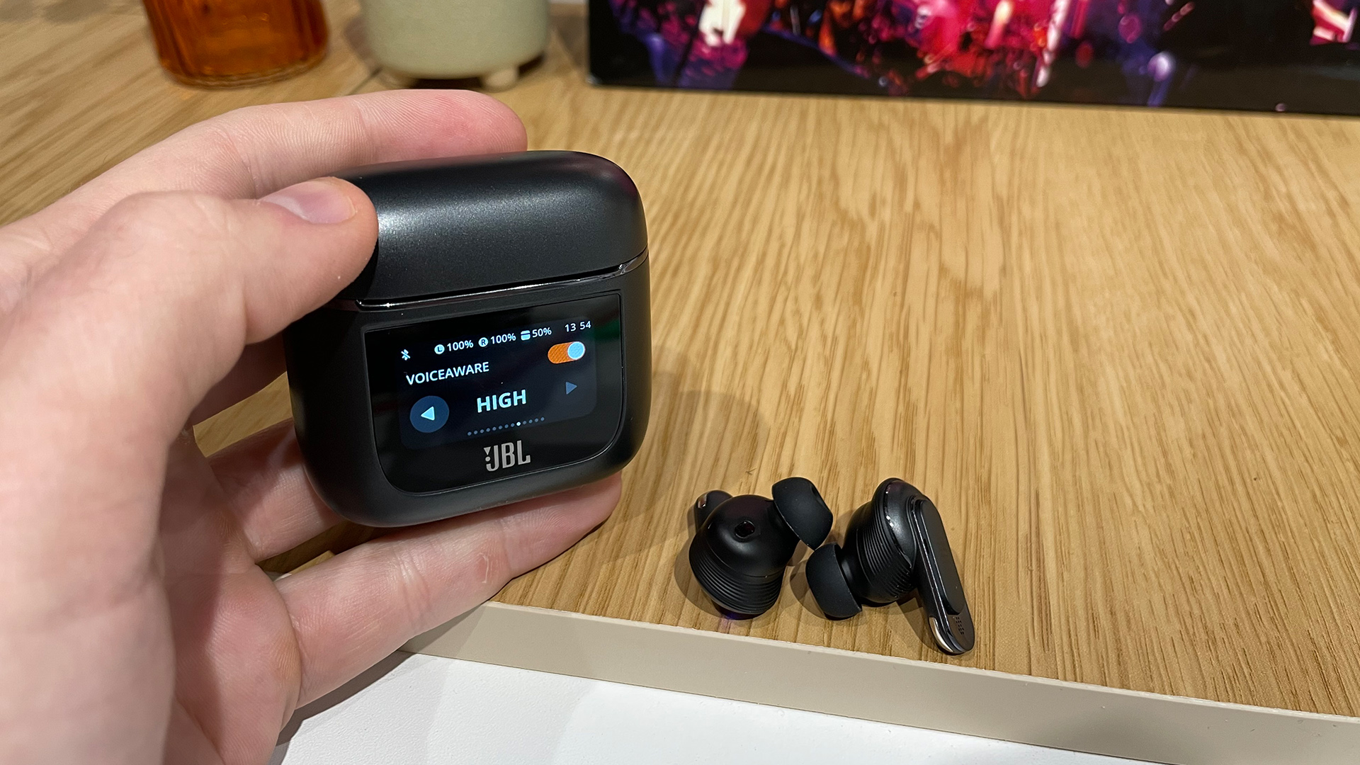
It was a few moments later, of course, that I realised that not only had American audio manufacturer JBL beaten its Apple rivals to the patent punch, but it had also gone one step further and really made the flipping thing. Yes, JBL’s new Tour Pro 2 wireless earbuds became the first to sport a charging case with a fully interactive touchscreen display, taking an idea that seemed like a ludicrous pipe dream and rendering it in three-dimensional scratch-proof plastic. We’ve had the pleasure of having the JBL Tour Pro 2 in our What Hi-Fi? offices for a while now, and the same question always pops in whenever I stare at that novel charging case: “Why”?
To an extent, I understand the reasoning behind the decision. As is true with almost every pair of wireless earbuds, most people do carry their charging case around with the buds as a means not only of storage but to ensure that they remain well-juiced and well-protected at all times. Having a pair of buds rattling around in your trouser pocket is a recipe for disaster, and nobody wants to see a not-insignificant amount of money quite literally going down the drain.
And who doesn’t like the idea of more convenience within the audio market? On-ear controls are very much widespread for easy access to basic playback controls, but the use of such facilities can be made tricky by the obvious drawback of just how small and fiddly the earbuds’ surface area usually is. Most companies have experimented with all manner of squeezing, pinching and prodding motions in order to switch tracks, alter volume or even change ANC settings, but the way they’re implemented isn’t always intuitive for all users. A physical touchscreen will always be superior to prodding the side of a couple of 2cm earbuds.
Here’s the issue, though: there’s already a device that sports a rather nifty physical touchscreen of its own, and it’s just as portable and convenient as JBL’s smart charging case. It is, as you've already guessed, your smartphone. Yes, the vast majority of your earbuds use is going to come via the connected smartphone, meaning that it’s hard to see exactly where an on-case display fits in terms of finding a niche function that doesn’t already exist.

The idea, presumably, is that you can just prod a few buttons on the display instead of having to fiddle around with the on-ear controls or else reach for your phone. But if you’re using your JBL Pro Tour 2 earbuds at home or work, for instance, why is it easier to grab a charging case than it is to reach for your smartphone, the latter of which is, in this modern world, more likely to be at hand than the former? Prospective case-makers Apple should know that reality better than anyone - it's a world the company itself helped to create.
And if you do happen to be on the go, chances are you’re listening to your music on your phone anyway, thus negating the need to have another on-case display in the first place. I personally can’t imagine many situations in which it’s more convenient, more useful or more intuitive to reach for said case rather than the device that handles 90 per cent of your life’s admin anyway.
Get the What Hi-Fi? Newsletter
The latest hi-fi, home cinema and tech news, reviews, buying advice and deals, direct to your inbox.
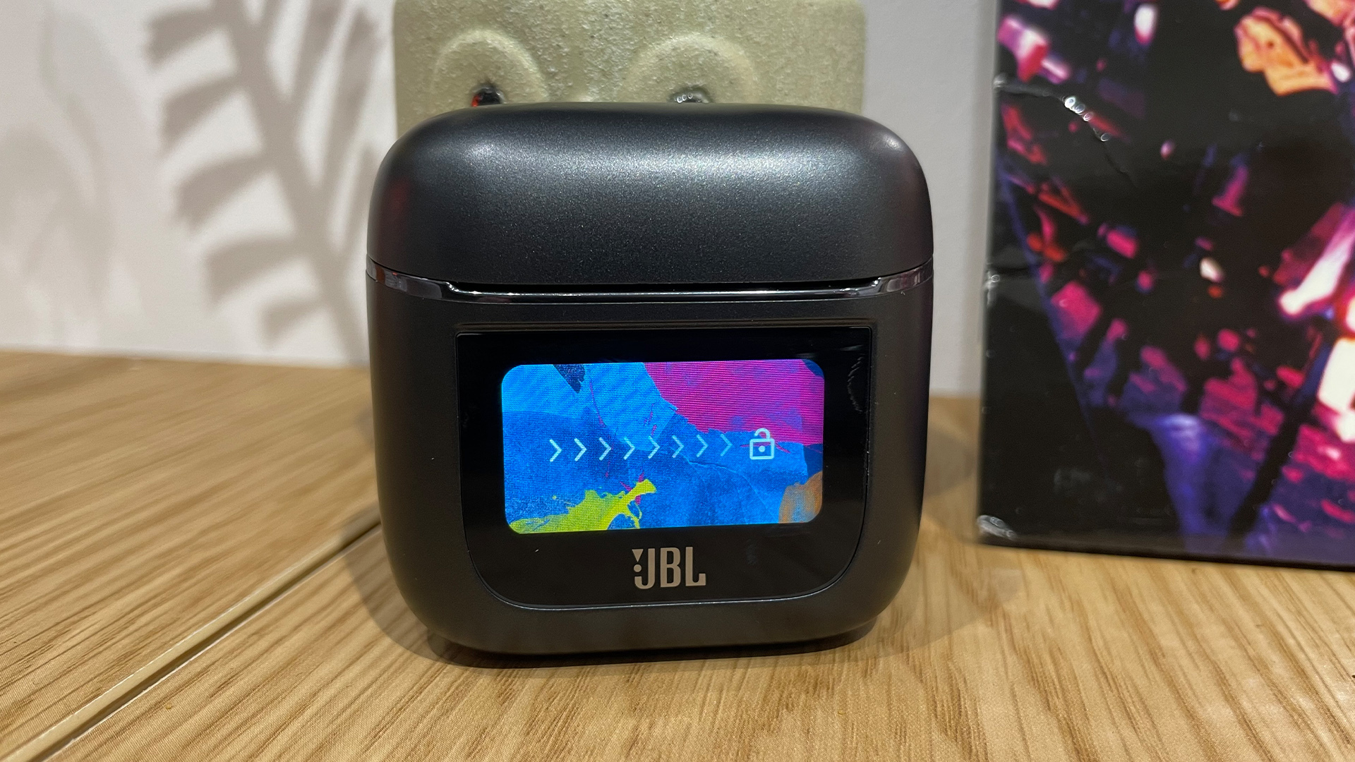
On top of this relative redundancy, then, JBL’s nifty new gimmick doesn’t really have anything to add to the party that your smartphone, and by extension the rather excellent JBL Headphones app, can’t do anyway. There’s a somewhat weedy flashlight that illuminates the front of the display but would be useless if you found yourself stuck in a collapsing mineshaft, not to mention a couple of artsy, paint splash-effect screensavers to enjoy, but these aren’t exactly dealmakers in the case’s favour. I need more than a paltry glowing frontage and a couple of slides from Jackson Pollock’s discarded back catalogue to be convinced to fork out for JBL’s latest, rather middling earbuds.
It’s also hard to see what the capacity for further utilities could be. Again, if the smartphone has all the portability and usability you need to adjust your JBL listening experience, it’s hard to see what future changes could bring about to give the smart charging case its own unique selling points. Some more pretty pictures? Cutesy on-screen text informing you that “Your earbuds are currently recharging, zzz?” A much brighter flashlight?
So I’m sorry, but for now, I don’t see JBL’s latest innovation as anything more than a flash in the pan, a fun gimmick to impress your friends at parties (if said parties are going extremely badly) and show off at tech demos to easily impressed audio junkies and bemused journalists. Apple's patent may bring something new to the party, but it's hard to think of something that a charging case could do (even in Apple's hands) that an iPhone couldn't handle. Siri integration, maybe? Again, the iPhone has that covered. And would you be willing to pay extra for a smart case for your AirPods compared to a standard case? I'm not sure I would.
I truly admire JBL’s commitment to doing something new, and maybe Apple’s own patent could give some market clout to the innovation if taken in a new direction or refined further, but I’m not convinced that this is something that people will need, or more importantly want, in the future. A sorry case indeed, and one that needs closing as soon as possible.
MORE:
Read our full JBL Pro Tour 2 review
JBL Charge 5 vs JBL Xtreme 3: which Bluetooth speaker is best for you?

Harry McKerrell is a senior staff writer at What Hi-Fi?. During his time at the publication, he has written countless news stories alongside features, advice and reviews of products ranging from floorstanding speakers and music streamers to over-ear headphones, wireless earbuds and portable DACs. He has covered launches from hi-fi and consumer tech brands, and major industry events including IFA, High End Munich and, of course, the Bristol Hi-Fi Show. When not at work he can be found playing hockey, practising the piano or trying to pet strangers' dogs.
