I'll only subscribe to Disney+ if it fixes these 3 things
Irritating navigation issues persist

The great Disney+ password crackdown continues. The latest news is that the House of Mouse plans to cut off password sharing this summer, and has already notified subscribers of a change in its terms and conditions forbidding account sharing with anyone outside their household. These new Ts&Cs went into effect on 14th March.
It's a brave move. But Disney has been emboldened by Netflix's same scheme last year. That saw subscriber numbers jump by more than 13.1 million in the following three months. It turns out that charging people to use your product is good business after all.
As long as the product is up to scratch, that is. And I'm unconvinced. While I enjoy the breadth and depth of content on Disney+, the functionality needs work. Disney, if you're hoping I sign up, you'd better fix these three issues.
1. Episode selection

Pick a show, and you should be able to select which episode you watch, right? It's a no brainer. Especially for shows like Bluey, when kids want a specific episode (and aren't shy about telling you).
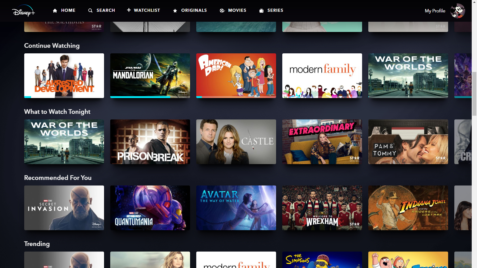
That's not how it works on Disney+. Instead, once you select a show, the last played episode starts up. Which makes sense. But if you want to choose a different episode, you have to head back to the homepage, and use the search function to find the show again. Even though you can see the show right there in the 'Continue Watching' row, you can't select an episode without manually searching for it (which involves selecting letters to spell out the show's name – a painfully slow process when using a TV remote).
Admittedly you can skip to the next episode from within the one that's playing. And the first time you select a show it'll let you choose which episode to watch (though this seems pointless, as inevitably you'll want to watch the first episode). But not being able to select an episode from the homepage is a real clanger of a UI oversight. Unforgivable.
2. Easier adds to watchlist

This is something my learned colleague Harry McKerrell has previously opined, but adding items to the watchlist really needs to be made easier. As it stands, if you want to add something like Only Murders In The Building to your watchlist (which you really should), you need to select said show and then click the + sign. Again, there's no way to do it from the homepage.
Get the What Hi-Fi? Newsletter
The latest hi-fi, home cinema and tech news, reviews, buying advice and deals, direct to your inbox.
How much simpler would it be to add the option to the homepage? That way, when you can't decide what to watch, you could scroll through what's new, adding anything that looks interesting. Then load up your watchlist, and see all your options in one place for a more detailed discussion. Because let's face it, we could all do with less aimless scrolling in our lives.
3. Better resume playing

How annoying this one is depends on what you're watching, and how stop-start your viewing is. But when you resume watching from the homepage, your content jumps back a little. (I'd like to think this is an intentional feature to recap what just happened, but I fear not.)
In short episodes the repeat is just a few seconds, but with the three-and-a-half-hour Taylor Swift: The Eras Tour, it can be closer to a minute. Which wouldn't be so bad, but when you're watching it in seven-minute chunks, as my kids currently are, it makes an already epic concert seem more like a months-long tour. And that's something I'd happily pay to avoid.
MORE:
Our favourite is free! 6 best streaming services for kids
I love offline mode on Netflix and Disney+, so why doesn't it work properly?
I'm furious about Amazon Prime Video's new prices, and not because of the ads
Joe has been writing about tech for 20 years, first on staff at T3 magazine, then in a freelance capacity for Stuff, The Sunday Times Travel Magazine (now defunct), Men's Health, GQ, The Mirror, Trusted Reviews, TechRadar and many more. His specialities include all things mobile, headphones and speakers that he can't justifying spending money on.
-
RichSM ReplyIn short episodes the repeat is just a few seconds, but with the three-and-a-half-hour Taylor Swift: The Eras Tour, it can be closer to a minute.
I think the reason for this is that it tracks your viewed time in percentages of the total length. A lot of streaming services record the last timestamp or keyframe you watched, but percentages would explain why this is happening on Disney+.
All services won't keep your viewed time completely up to date in real time though, because the client will only send a "I've watched this bit" only once it has played it, so if you hit stop between those pings, the server will send you back to the last successful one.

